A curious colour named after a fruit
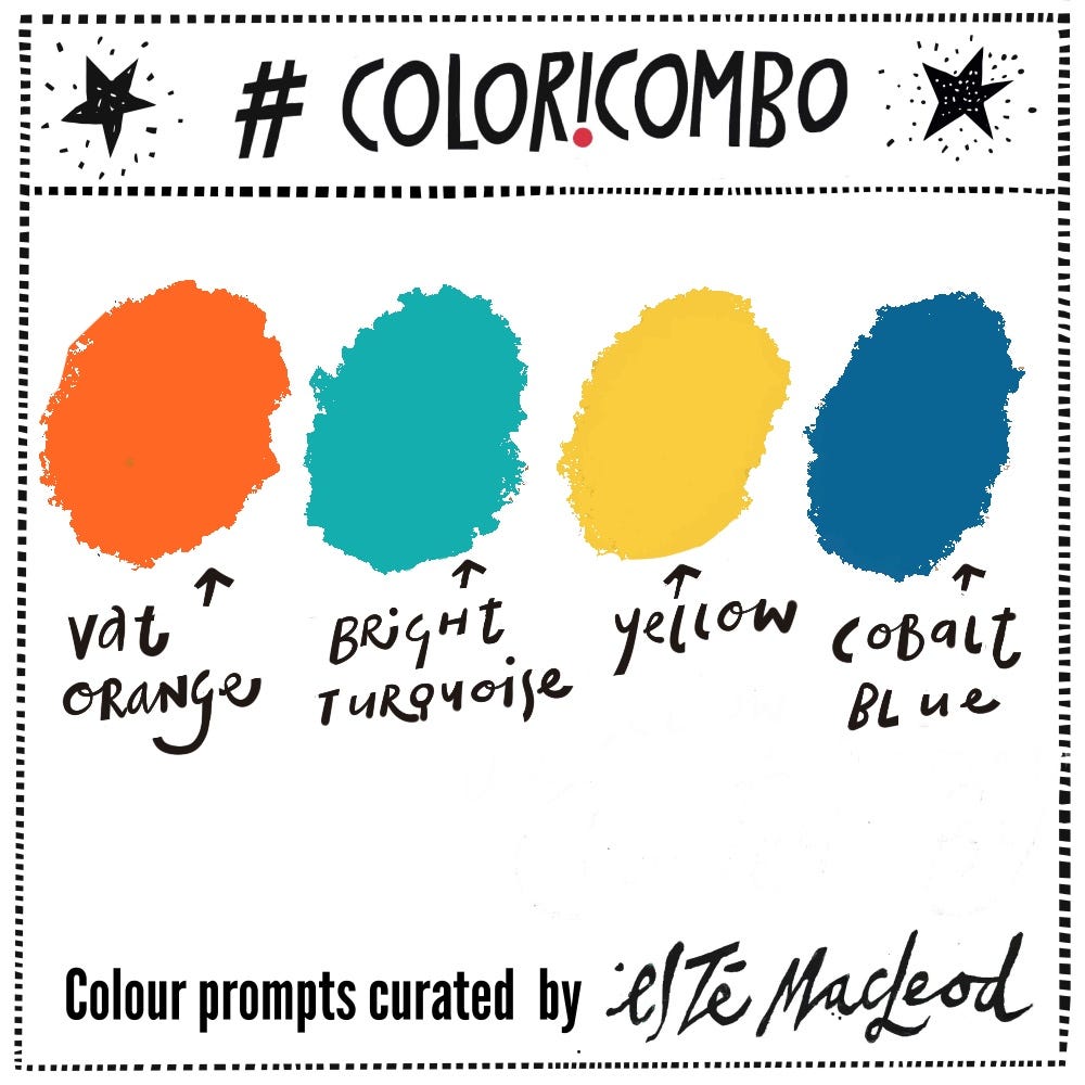
Week Thirty is Vat Orange, Bright Turquoise, Yellow & Cobalt Blue
“There is no blue without yellow and orange” - Vincent van Gogh
The Coloricombo colour and creativity program of weekly prompts is now in it’s fifth year and this week I’m highlighting a colour that’s been featured before, at the start of 2025. It’s a warm and inviting colour that evokes feelings of happiness, positivity and energy. According to the room colour psychology, orange encourages creativity.

Over the last few weeks I have been working on a several projects including something coming up soon, The Summer Creative Retreat where I’ll be presenting a lesson. There’s a bonus of four dynamic colour palettes and as the shortlist was put together I figured one with the complimentary colours of orange and blue ought to be part of the collection.
I’ll tell you more about the other three palettes in the coming weeks. As I said they are linked to The Summer Creative Retreat and you can still sign up for this event with live workshops running from 1-6 August. It’s FREE for a limited time.
On Monday 3 August I will be teaching a 45 minute long workshop titled Small & Mighty where I’ll show you how to layer colours and shapes to create miniature artworks in a sketchbook.
Let’s dive into orange with today’s post and ten fun facts about the colour.
The colour didn’t have a unique name until after the fruit arrived. Before oranges reached Europe, English speakers called that colour geoluread or yellow-red. Orange as a colour only appears in English around the late 1500s.
The word orange comes from the Sanskrit word nāraṅga and arrived in Europe languages via Persian nārang and Arabic nāranj.
Oranges were first grown in China and India thousands of years ago. It is in fact a hybrid of pomelos and mandarins.
In countries like India, orange is a holy colour in Hinduism and Buddhism worn by monks to show a focus on peace and truth.
The fruit first appeared in England in 1390 with royal purchases of the sour Seville variety, but it wasn’t until the 1600s that oranges became affordable.
The bitter oranges were transported in barrels filled with salt water on their sea voyage from Spain to England. This explains why traditional orange marmalade has a distinct salty-sour edge.
Samuel Pepys mentions oranges frequently in his diary. They were popular as snacks for theatre goers, luxury gifts, garden curiosities and even a novel beverage! Pepys recounts drinking a full pint of orange juice in March 1669 and wondering if this new drink might upset his stomach.
Before becoming a actress and royal mistress, the famous Nell Gwyn started as an orange girl who would have been selling small sweet China oranges to theatre goers.
England’s climate was too cold to grow oranges so cultivation in the late 1600s involved orangeries, a room or building where trees were moved when the weather turned, heated using fires and stoves over winter.
Around the same time, the colour orange was adopted as the national symbol of the Netherlands through William of Orange who led the country’s uprising against Spanish rule. Confusingly, his title came from an inherited feudal state in southern France, Orange, named after Arausio, a Gaulish god. So not after the colour or the fruit… fascinating stuff.
For this week’s coloricombo prompt, I’ve chosen a palette from a vintage advertising poster. Think of images of a warm Italian summer (or spring skiing) and this distinctive drink springs to mind.
Aperol was created in 1919 by the brothers Luigi and Silvio Barbieri in Padua, Italy and the advertisement is a vintage poster illustrated by the artist Piquillo in 1931, capturing the early Art Deco marketing era of the brand.
The Barbieri brothers inherited their father’s liquor company and spent seven years experimenting with recipes for a new aperitif. They wanted to disrupt the market by creating a liqueur that was lower in alcohol and with a unique taste. Aperol was launched at the Padua International Fair in 1919 and is now an iconic symbol of Italian social life!
Read more about Aperol here and here and about William of Orange here.
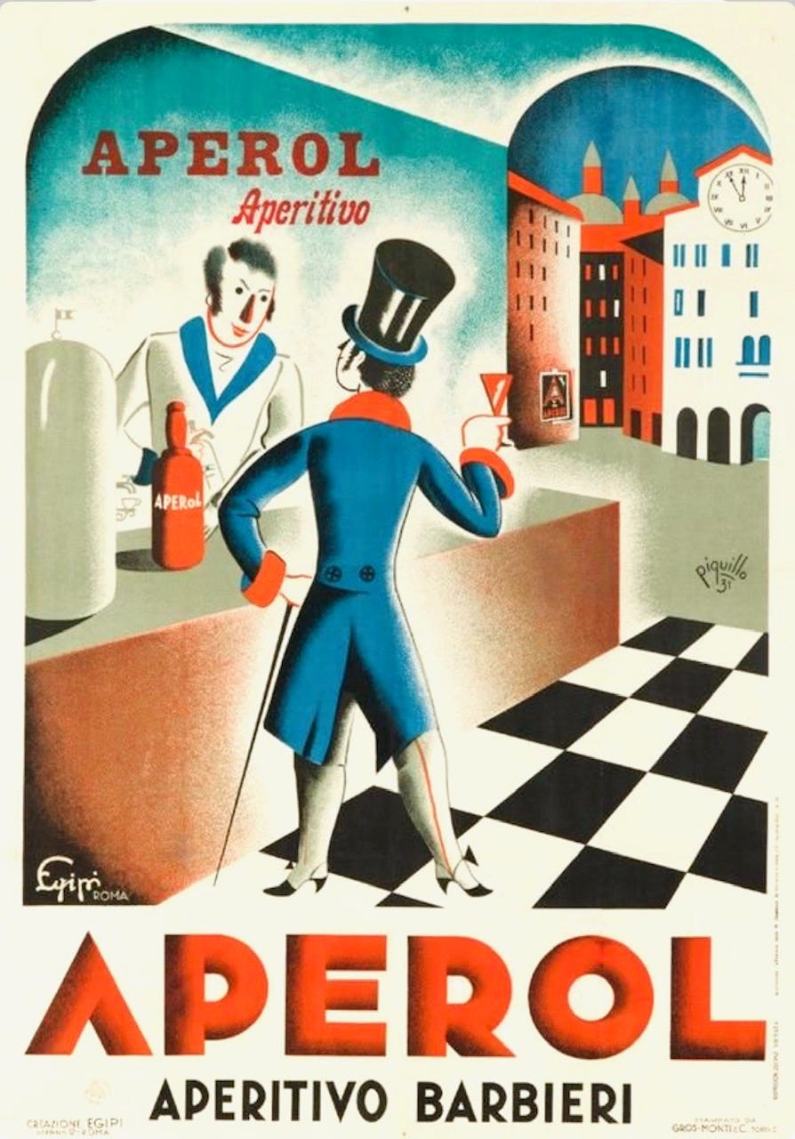
“Aperol”, advertising poster, vintage 1931 advertising, Carlo Pandolfi, 1931
Colour Combination
The colours this week are Vat Orange, Bright Turquoise, Yellow & Cobalt Blue. Use them along with a contrasting dark and neutral light colour to create an artwork in any medium or style. Know someone who might enjoy a weekly dollop of colour and creativity? Why not share this post with them?
Shapes
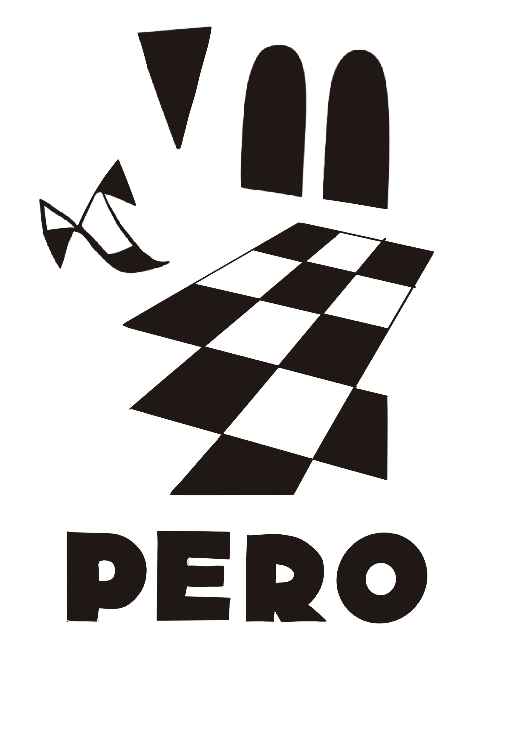
Along with the colour prompt I am including some shapes inspired by the artwork which you can download as a PDF and print out to use as you wish