

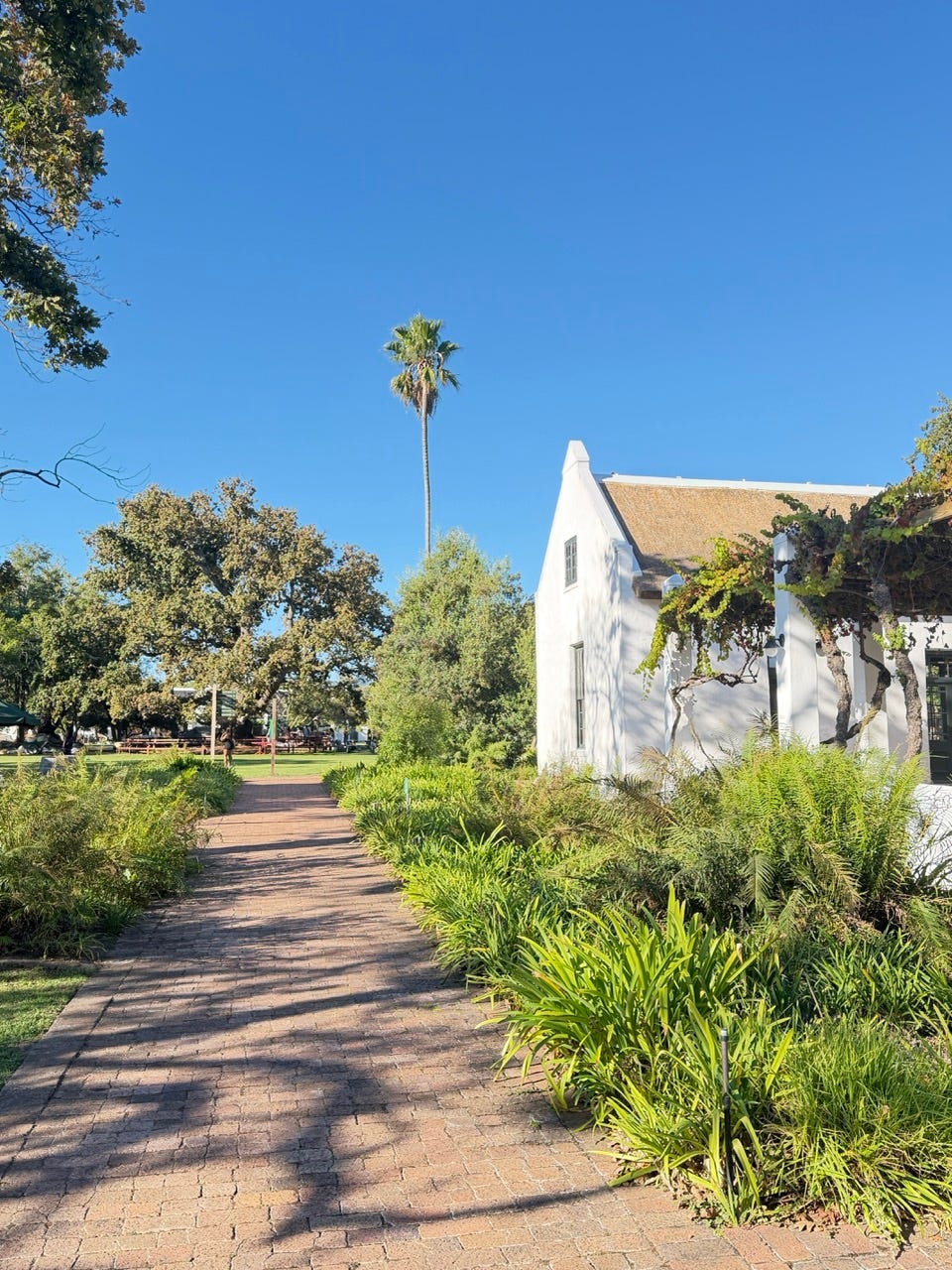
Inspiration from a wine estate
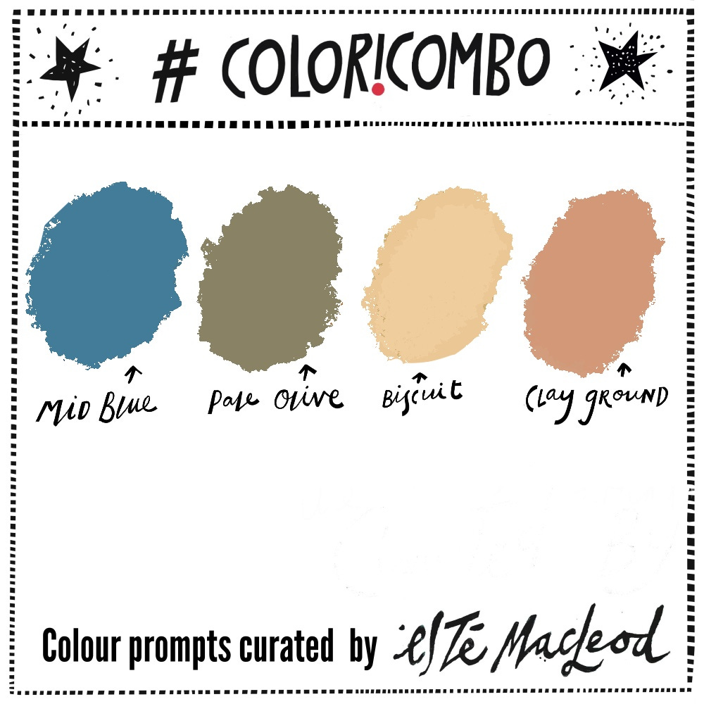
Week Ten is Mid Blue, Pale Olive, Biscuit & Clay Ground
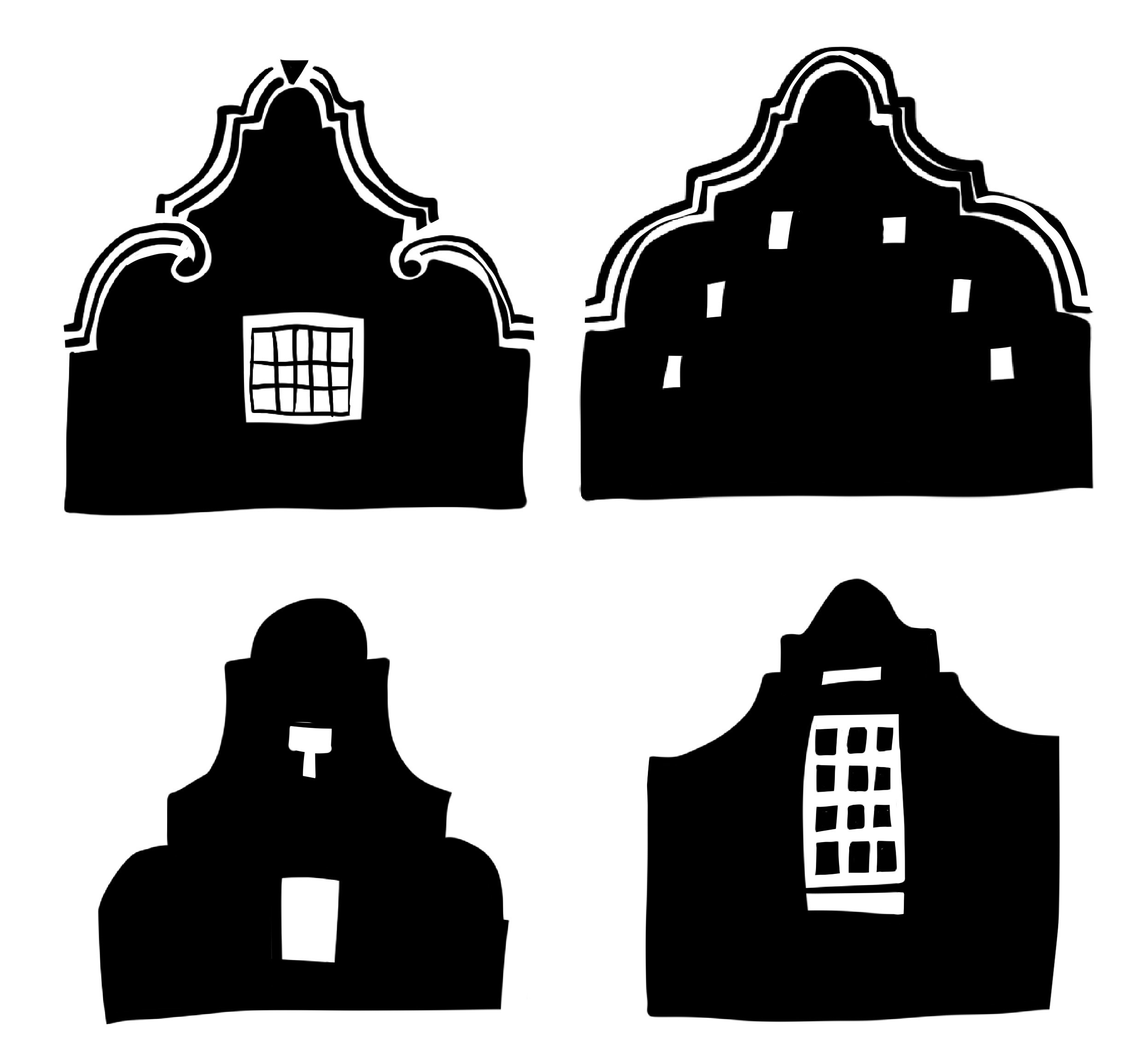
We have a couple of days left on our break in the Western Cape of South Africa and are spending time in the wine regions around Stellenbosch and Franschhoek. We visited the Spier estate yesterday and this week’s #coloricombo inspiration comes from an artwork depicting one of the buildings on the estate, designed with the iconic gables of the Cape Dutch architectural style.
William Mitcheson Timlin (1892-1943) was born in Northumberland, England, the son of a colliery fireman which isn’t the most obvious background for one of South Africa’s most imaginative and multifaceted artists.
Timlin won a scholarship to the Armstrong College of Art in Newcastle, England and in 1912 travelled with his parents to Kimberley, South Africa, at that point described the Diamond Capital of the World which was then transitioning away from it’s rough and lawless reputation with the closing of the Big Hole open cast mine in 1914 and the consolidation of deep level mines under the De Beers Corporation.
Timlin completed his studies in art and architecture and never left, making Kimberley his permanent home and the place where he would build one of the most extraordinary creative careers of the early twentieth century.
As an architect, Timlin’s influences are all over South Africa’s cultural fabric. He designed several major buildings in Kimberley including the hospital, high schools and war memorial and went on to contribute interior designs to some of the country’s most celebrated theatres including the Alhambra in Cape Town and the Colosseum in Johannesburg, both considered architectural landmarks of their day. He also founded the Art Section of Kimberley’s Athenaeum Club in 1914 and designed the first cover of the Outspan magazine, illustrating many of its stories.
Alongside his architectural practice he produced a remarkable body of watercolours, oils, pastels, etchings and fantastical illustrations - dreamlike, intricate worlds of fairies, goblins, celestial landscapes and otherworldly architecture. In 1921 he began work on a fantasy book, primarily as a diversion for his son. Over two years it expanded into forty eight pages of handwritten text, each one with a colour plate that showcased his extraordinary imagination and skill as a watercolourist.
The book titled The Ship that Sailed to Mars was published in 1923 and has become a fantasy classic, with the publisher so captivated by the illustrations and calligraphic text that they printed it without any further typesetting.
Timlin died in Kimberley in 1943 leaving behind an incomplete second book The Building of a Fairy City. A collection of his works were acquired by the De Beers Company and donated to the William Humphreys Art Gallery in Kimberley, the gallery that took over from Timlin’s own Athenaeum Club.
Read more about Timlin’s book here or watch a brief video showing it’s illustrations here, about the Athenaeum Collection here and available works here.
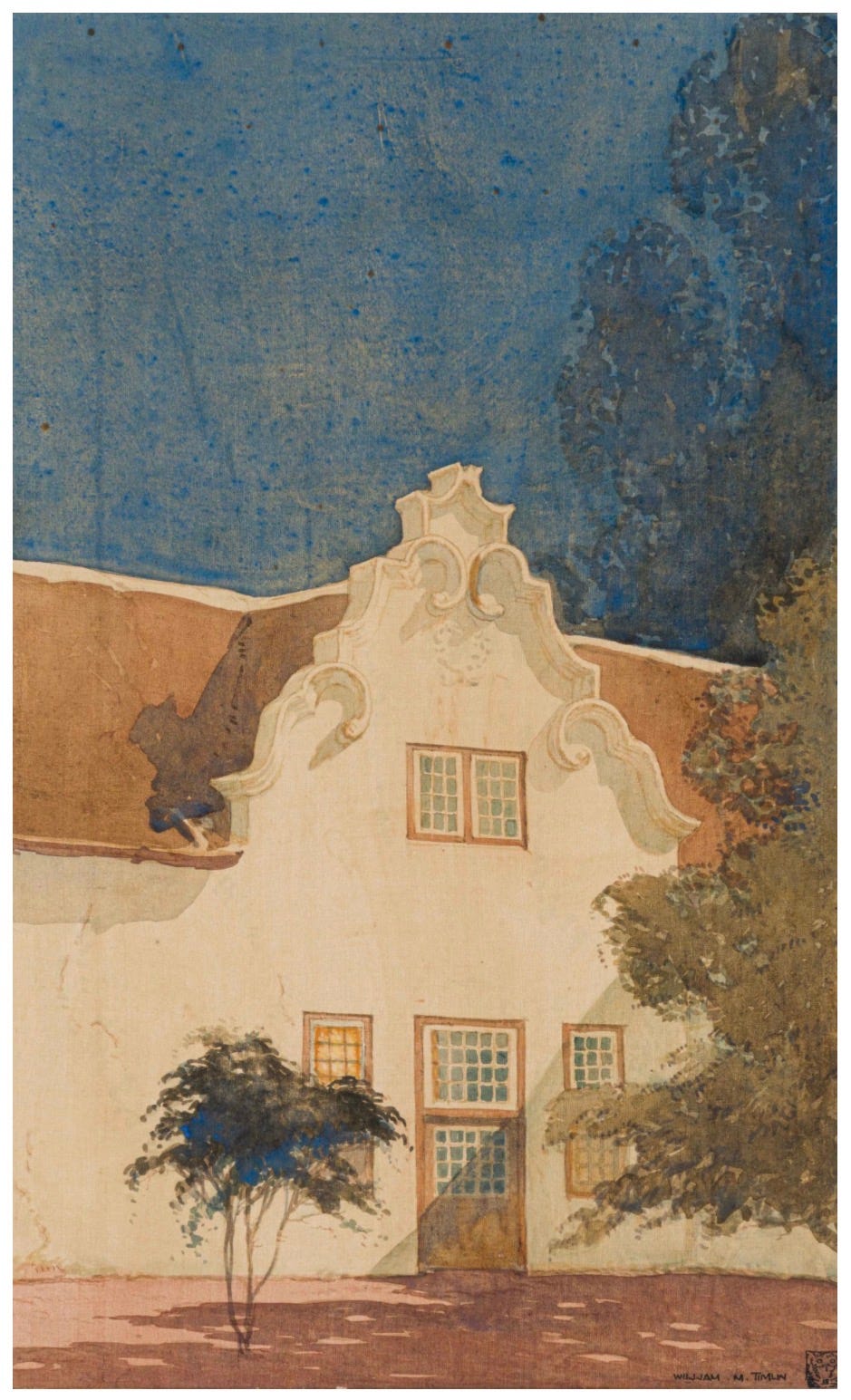
“Cape Dutch Building (Spier, Stellenbosch)”, watercolour on silk laid on board, William Mitcheson Timlin, date unknown
Colour Combination
The colours this week are Mid Blue, Pale Olive, Biscuit & Clay Ground. Use them along with a contrasting dark and neutral light colour to create an artwork in any medium or style. Know someone who might enjoy a weekly dollop of colour and creativity? Why not share this post with them?
Shapes
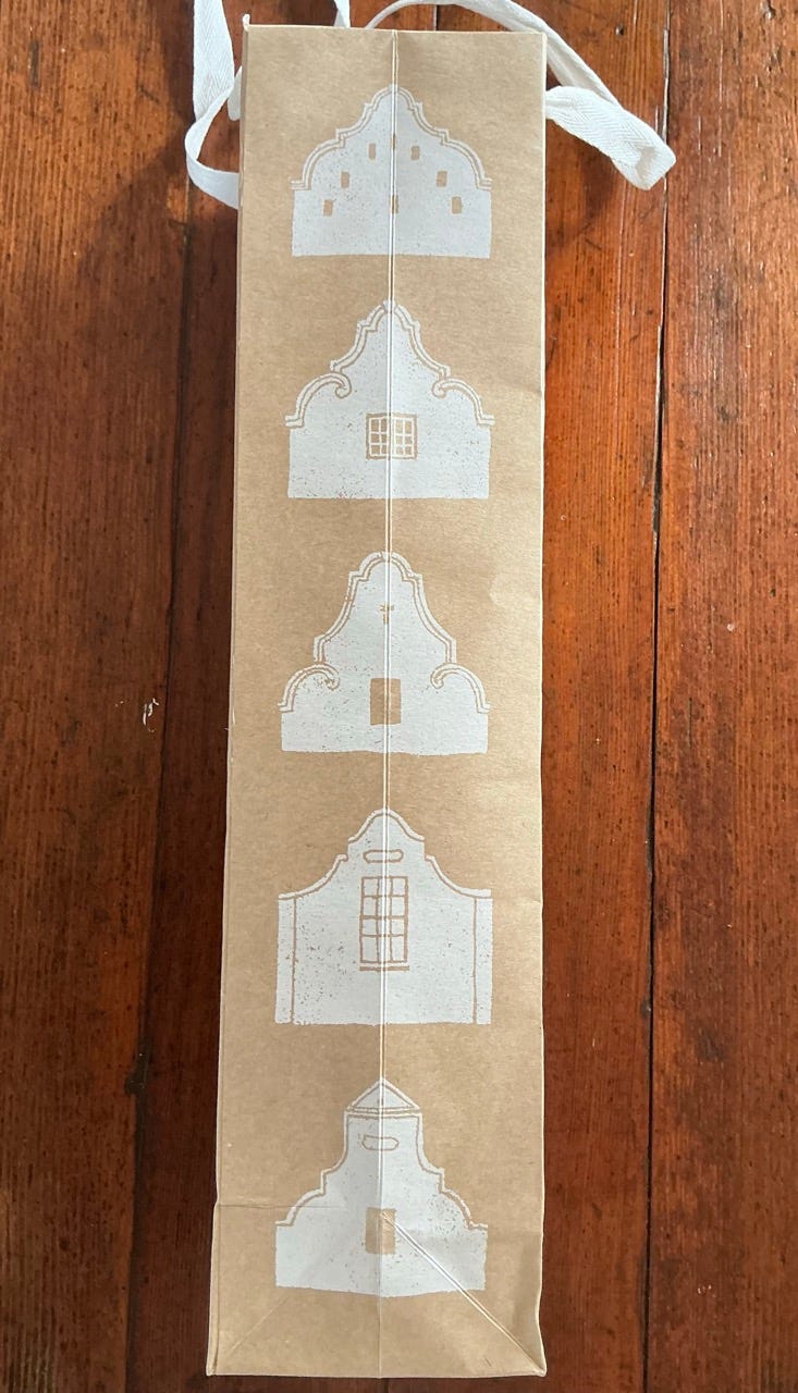
Along with the colour prompt I am including some building shapes inspired by the designs seen on the packaging of our wine purchase yesterday, you can download these as a PDF and print out to use as you wish.
I love Dutch architecture!