

Revisiting some favourite colours
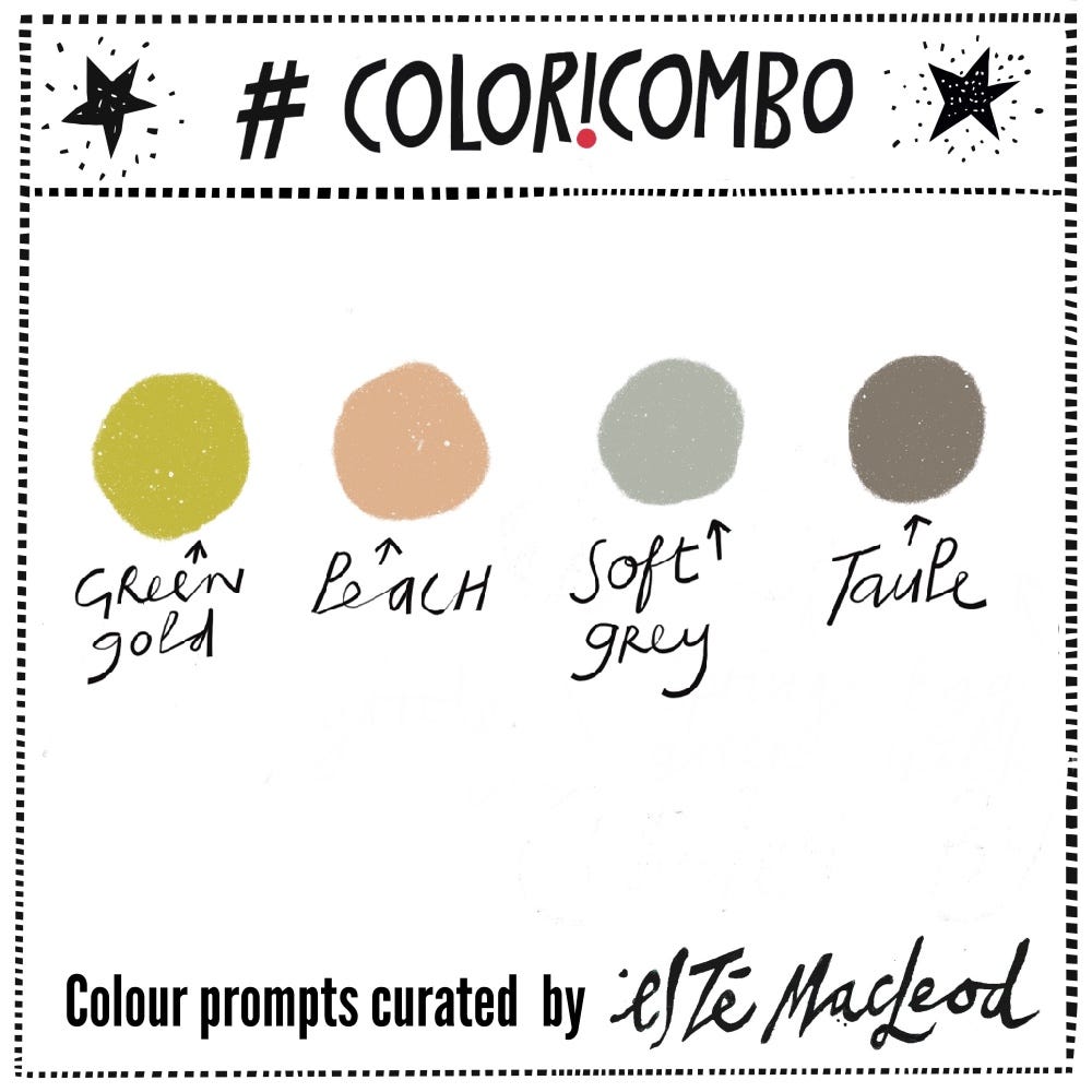
Week Four is Green Gold, Peach, Soft Grey & Taupe
January has been a busy month for me (I’ll show you what I’ve been working on in February). This week I am sharing a post from the #coloricombo archives, Week Four of 2024. I love the soft and warm colour combination of the print by the artist Sheila Robinson, so am featuring it once again.
Contributing subscribers have access to a fifteen minute demo where I show how High Chroma watercolours are mixed with Designer gouache to create the chosen colours.
Remember that contributing subscribers also have full access to all the archives on Substack (which go back to 2023). Here’s the link to the original post.

This week’s Coloricombo prompt is inspired by an artwork of the English artist, printmaker and illustrator, Sheila Robinson.
Robinson (1925-1988) was born in Nottinghamshire, attending the Nottingham School of Art and the Royal College of Art. There she studied under the tutorage of Edward Bawden, assisting him with his large mural for 1951’s Festival of Britain.
Whilst studying, Robinson married the artist Bernard Cheese. They had two children and after their divorce Robinson moved with the children to Great Bardfield in 1957 where she joined a thriving art community of mostly printmakers. Robinson was a skilled printmaker herself and often worked in the distinctive medium of cardboard cut prints, producing a well known body of work based on local street scenes.
Throughout her career Robinson undertook a wide range of commercial commissions, including a series of stamps for the Post Office in 1966 and again in 1970. She produced advertising posters for the BBC and for London Transport and provided illustrations for books including D.H. Lawrence’s Sons and Lovers and The Oxford Illustrated Old Testament.
Her freelance work comprising illustrations and prints were exhibited at the Royal Academy and other London galleries. Robinson taught at the Royal College of Art who, after her death, created the Sheila Robinson Drawing Prize in her honour
A modest and unassuming artist, she is now principally remembered for her distinctive and beautiful prints which reflect the interest and humour with which she viewed the world.
Read more about Robinson here and from the Fry Gallery in Great Bardfield here.
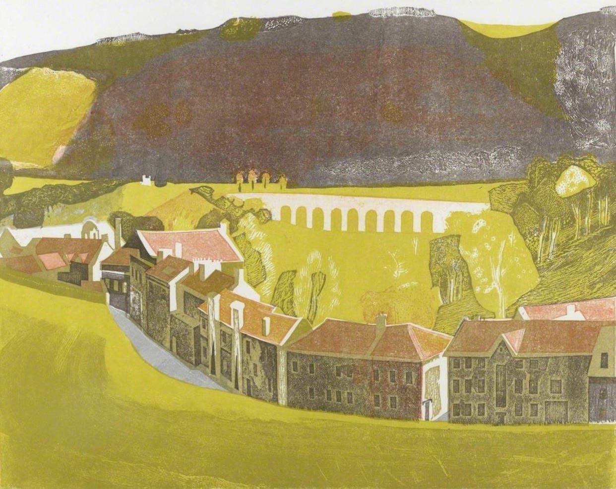
“Monkton Combe, Somerset’, coloured linocut and card print, Sheila Robinson, 1964 (© Estate of Sheila Robinson)
Colour Combination
The colours this week are Green Gold, Peach, Soft Grey & Taupe. Use them along with a contrasting dark and neutral light colour to create an artwork in any medium or style. Share this post with someone who might enjoy a weekly dollop of colour and creativity.
Shapes
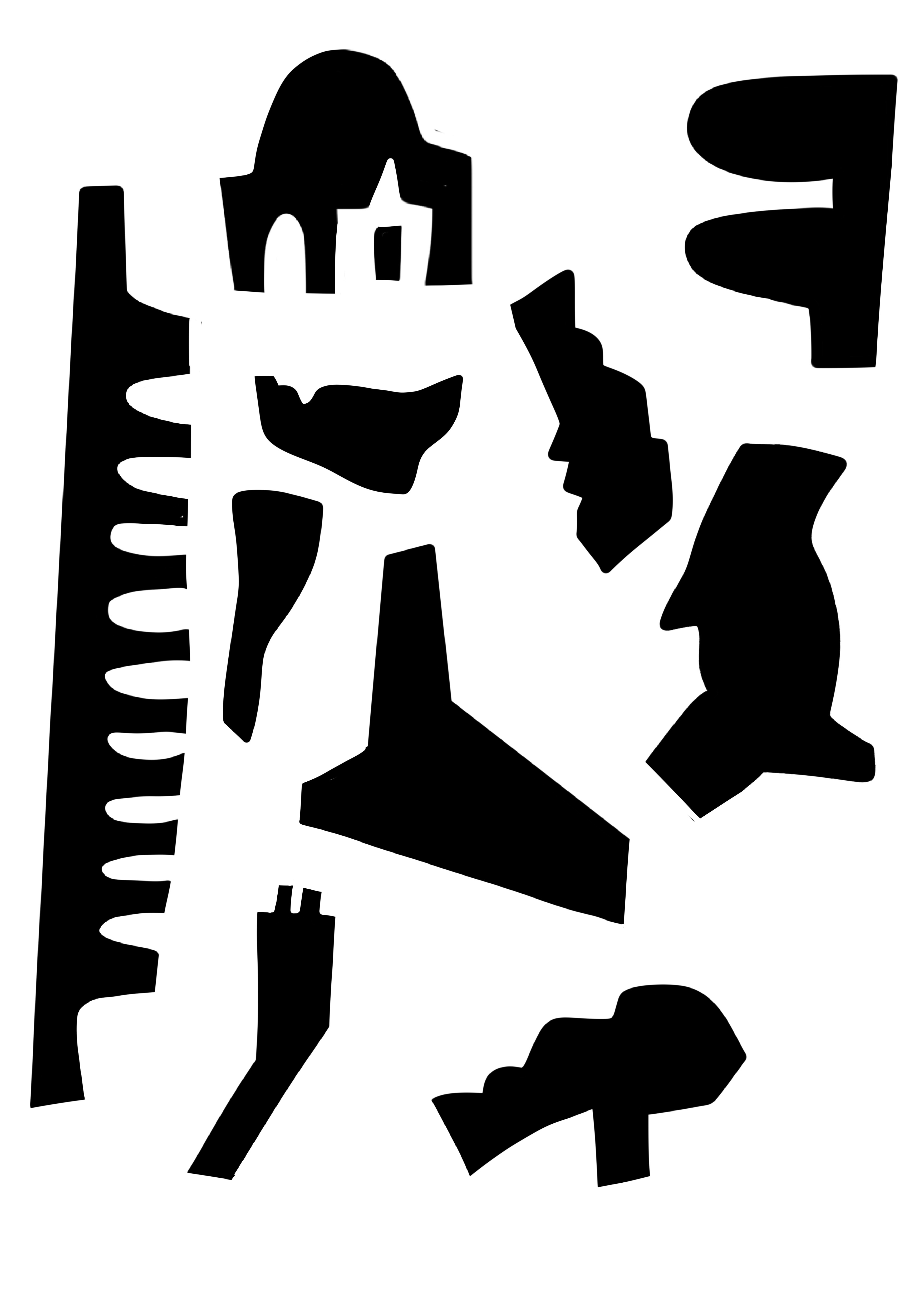
There are beautiful shapes in the featured artwork, I picked out a few, have a look and find some more to inspire new ideas. Download the shapes as a PDF and use it as you choose, maybe as background elements or cut the shapes out and rearrange them. I love seeing what you create with the shapes and post in the Facebook Group. Keep them coming.
Demo
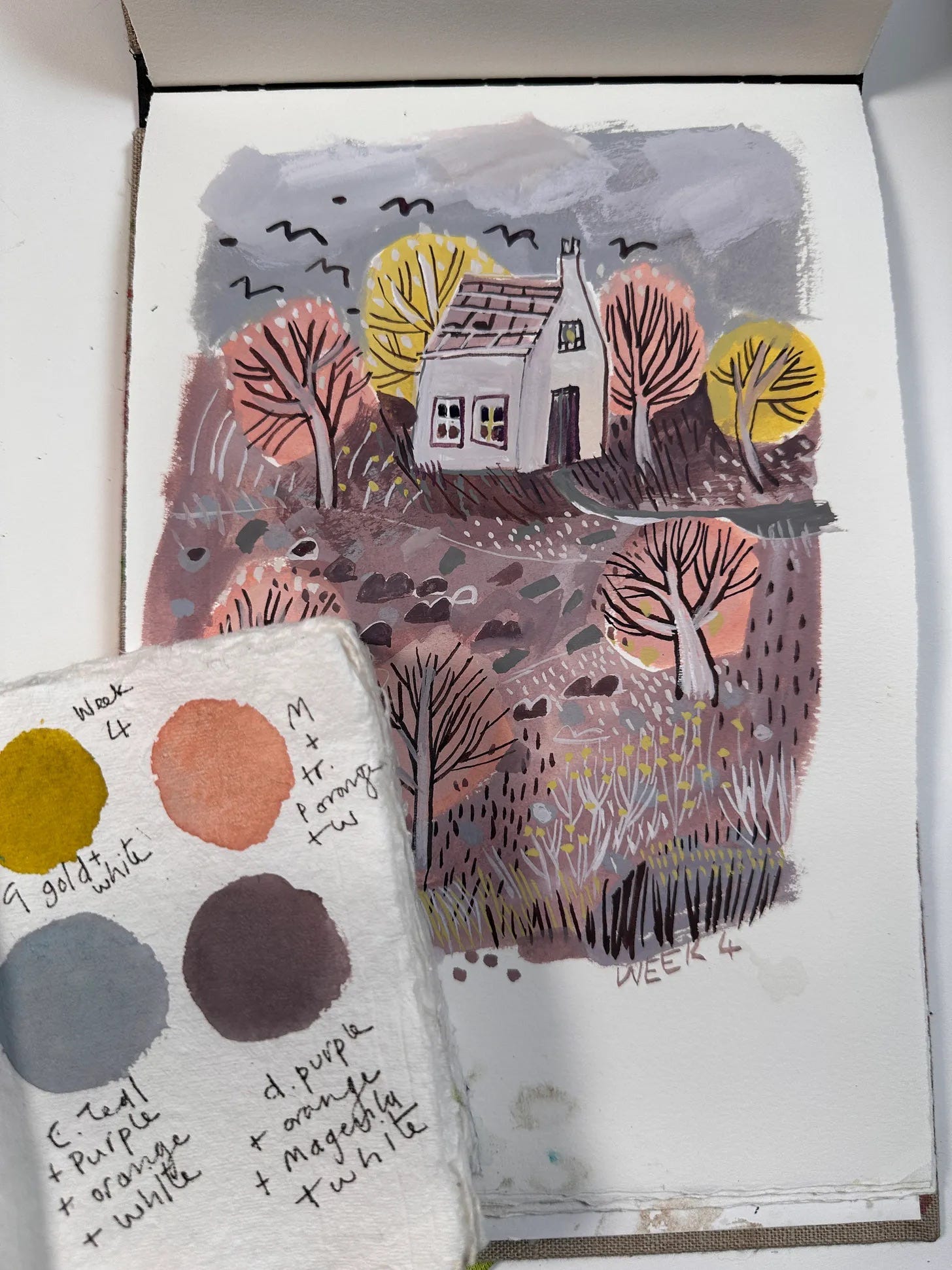
Contributing subscribers can watch a sixteen minute long demonstration of this painting where, I also demonstrate the mixing of colours. It’s done in my sketchbook on 300gm cold pressed watercolour paper.
