

Something different, let's mix it up
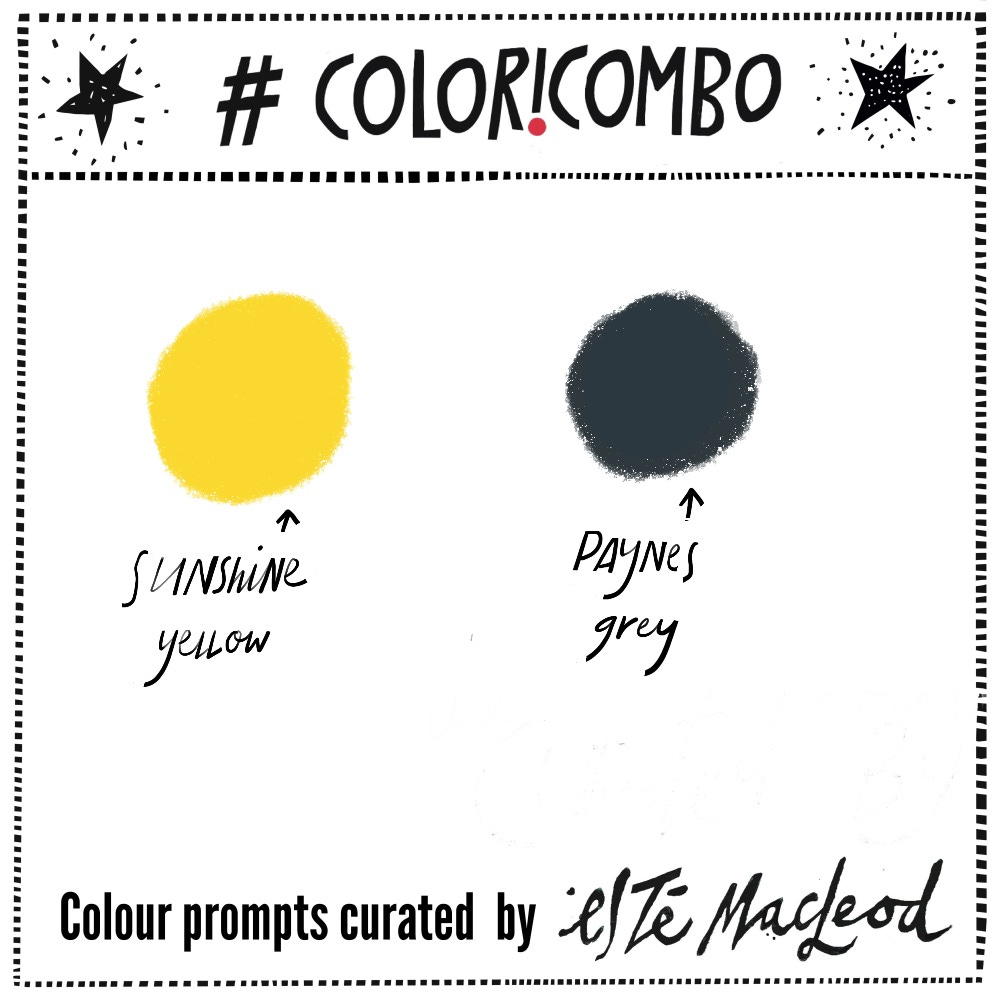
Week 12's colours are Sunshine Yellow & Paynes Grey + mixing combinations
This post contains affiliate links.
Before I talk about this week’s #coloricombo colour prompt, I wanted to mention that there’s a second post coming out today linked to my Collage Makers Summit lesson. You can still join, registration is open until 30 March and there’s lifetime access to all content.
For this week’s prompt I’m doing something different: there are just two colours for Week 12 and the idea is to mix them up to explore possibilities.
During a recent podcast interview (releases 25 March) with Quilter on Fire, about my new quilt fabric collection with Free Spirit Fabrics I was asked about my favourite tool as artist.
I mentioned that I actually have two, read on to find out what they are!
In the video demonstration below I paint a floral watercolour in a sketchbook, with a mix of this week’s colours. Combining yellow and black (or Paynes Grey when using watercolours) result in a beautiful variety of greens and greys. It’s a really useful exercise for exploring possibilities with limited colours.
There’s more! International Water Day was last Saturday (22 March) and I recorded a second 30 minute long video using the words Water Day as starting point for a peony shaped flower. In it I explained how to incorporate acrylic ink for added contrast and depth, and how acrylic ink and watercolour painting techniques overlap and differ. This content is exclusively for contributing subscribers.
Have you every noticed how many Spring flowers are yellow? Think of daffodils, aconites, primroses, mimosa trees, cowslips, dandelions and forsythia, they are all yellow. The answer is that yellow is a pigment that is easily produced as plants emerge, and it is also most visible to pollinators.
Yellow is an attention grabbing colour and would explain why yellow and black are used for caution signs. Did you know that the entrepreneur John D Hertz didn’t just give his name to the car rental franchise with it’s yellow and black logo? He also founded the Yellow Cab Company! Read more about this entrepreneur and philanthropist here.
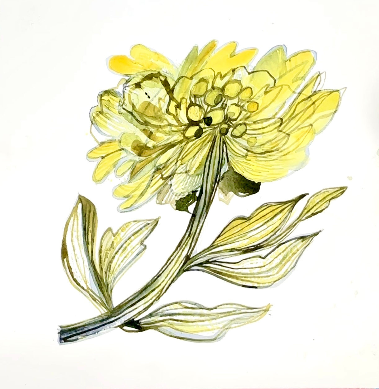
‘Yellow Peony” Watercolour and ink drawing, Este MacLeod, 2025 (video demonstration below)
Colour Combination
The chosen colours this week are Sunshine Yellow and Paynes Grey. Mix them up and use them together to create different olive greens and neutral colours, you can add black ink into the mix if you like for added contrast, see video below. Create an artwork in any medium or style.
As always, I love seeing what you’ve created. If you’re posting on Instagram, please tag #coloricombo and #estemacleod and join us in the private Facebook group Creative Prompts.
Why become a Paid Subscriber?
I’ve been putting together this newsletter since 2022 and it’s thanks to my contributing subscribers that I can spend time researching and recording content every week. I’m grateful for their support. Paid subscribers also get:
Exclusive content such as video demonstrations and lessons.
Unrestricted access to the archive: all of 2025’s #coloricombo content, videos of colour mixing and artwork demos.
Early notification upcoming events and courses with a 20% exclusive on all current courses.
Floral Sketchbook Demo
This demo highlights my two favourite paintbrushes, a fan brush and a 1/4” dagger brush by Silver.
If you’re a paid subscriber, you can see another video below where I go a bit deeper and explore a variety of techniques and processes using the two brushes for sketching, layering watercolour and demonstrating how black acrylic ink can be mixed with watercolour to add fine detail, dimension and contrast.
Materials used are:
Watercolour pad (I use Hahnemuhle)
QoR watercolours (Nickel Azo Yellow and Paynes Grey)
Golden High Flow black paint
Silver Silk 88 dagger brush 1/4” and Silver fan brush


