

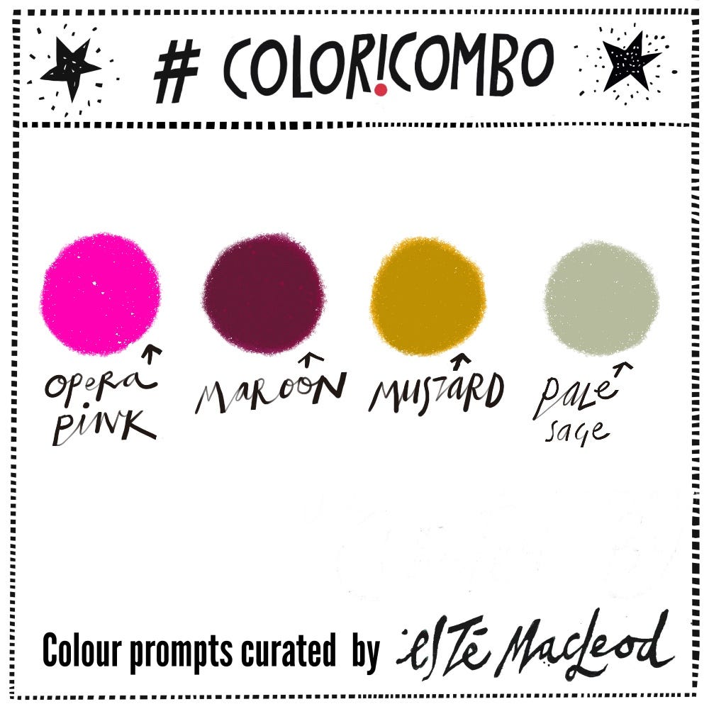
That palette with the Opera Pink
Week Twenty Two's colours are Opera Pink, Maroon, Mustard & Pale Sage
The Colori Flori Summit has just finished, if you wanted to jump in and join us do so today please. The summit comes with lifetime access and I’ve kept registration open an extra 24 hours, closing tonight (Monday 1 June) at midnight PST.
A year ago the first Colori Flori Summit concluded with a bonus project where colours from the commencing week’s #coloricombo prompt were used to paint the floral artwork you can see below.
The video lesson of the creating process is shared with contributing subscribers, scroll to the bottom.
The post from last year ago was titled ‘Pink makes everything fabulous’ (attributed to Barbie!) and proved to be a hit, this interesting combination of maroon, mustard, sage and the punchy pop of pink.
I’m sharing the palette again this week, I personally love this dynamic combination and think it deserves an encore.
In this year’s summit, two artists chose to incorporate these colours in their lessons, Janet Skates and Betsy Walton, and they both had their own unique interpretations of how to use the colours with Betsy diving into colour mixing and creating a beautiful range of colours including a variety of neutrals.
Did you know that Barbie has her own pink? It’s Pantone 219C which is pretty darn close to the Opera Pink in this palette.

Opera pink’s origins trace back to the development of synthetic dyes in the mid-19th century, particularly the discovery of mauveine by William Henry Perkin in 1856. This breakthrough in chemistry led to a revolution in available colors, making vivid, previously impossible shades accessible for the first time.
What we now call opera pink was popularised during the Victorian era’s fascination with the bold, saturated colours that were made possible by these new aniline dyes. The colour became associated with the theatrical world because opera houses and theatres of the late 1800s embraced these dramatic new pigments for their costumes, sets and interior decorations.
Before synthetic dyes, achieving such intense pink shades was near impossible. Natural sources like cochineal insects could produce reds and some pinks, but nothing quite as vivid and stable as what became possible with synthetic chemistry. Madder root and other plant-based dyes also provided pinks, but they were typically more muted.
Today opera pink is created using modern synthetic pigments and can be precisely formulated across different media, from paints to textiles to digital displays. The paint however remains a fugitive colour and it’s known that it’ll fade over time.
Read all about opera pink in more detail here.
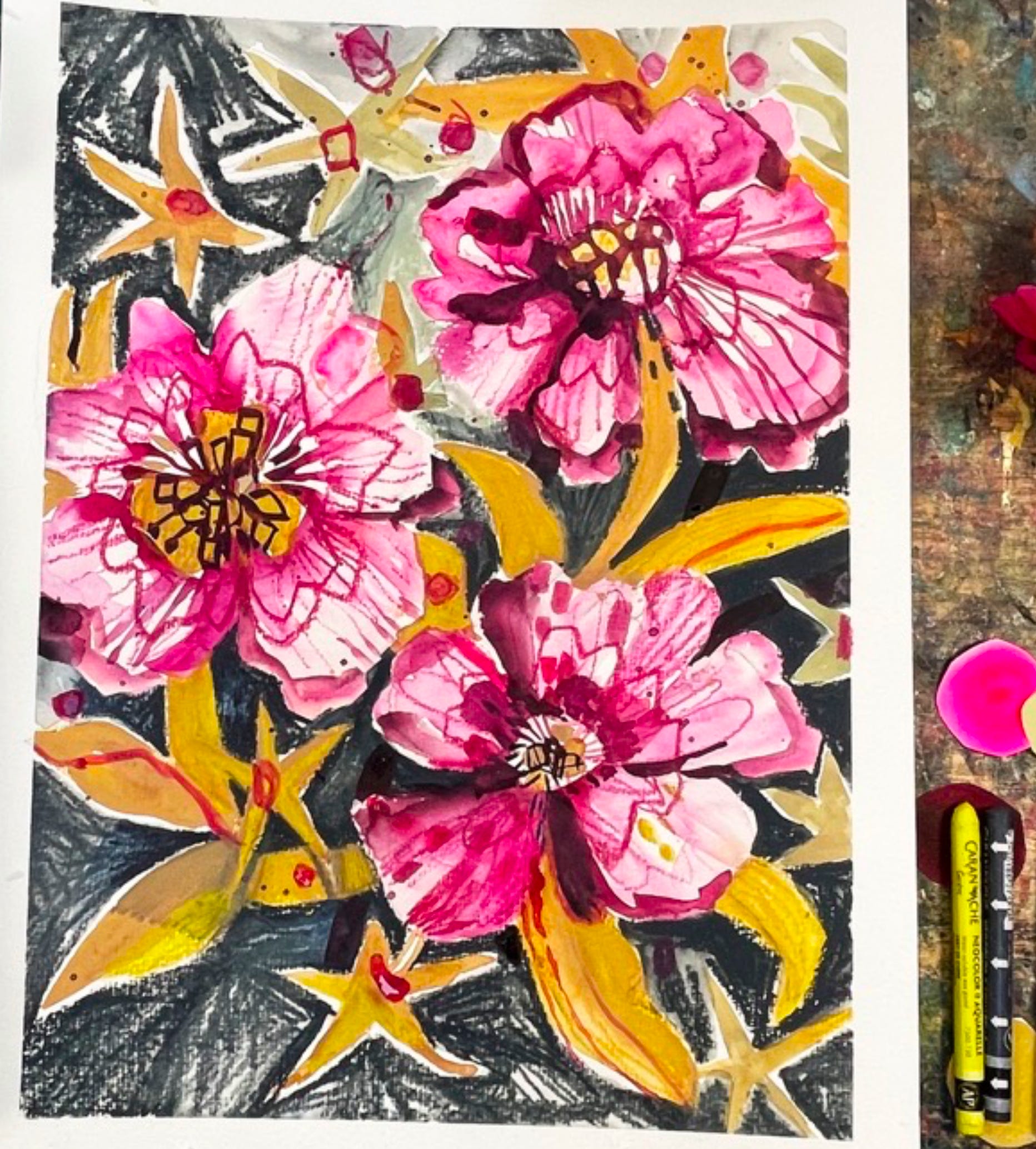
“Pink peonies, Colori Flori”, gouache and aquarelle, Esté MacLeod, 2025
Colour Combination
The colours making a repeat appearance from the archive are Opera Pink, Maroon, Mustard & Pale Sage. Use them along with a contrasting dark and neutral light colour if you wish. Create an artwork in any medium or style.
Share what you create, we love to see how the colours are used for art making. If you’re posting on Instagram, please tag #coloricombo and #estemacleod and join us in the private Facebook group Creative Prompts
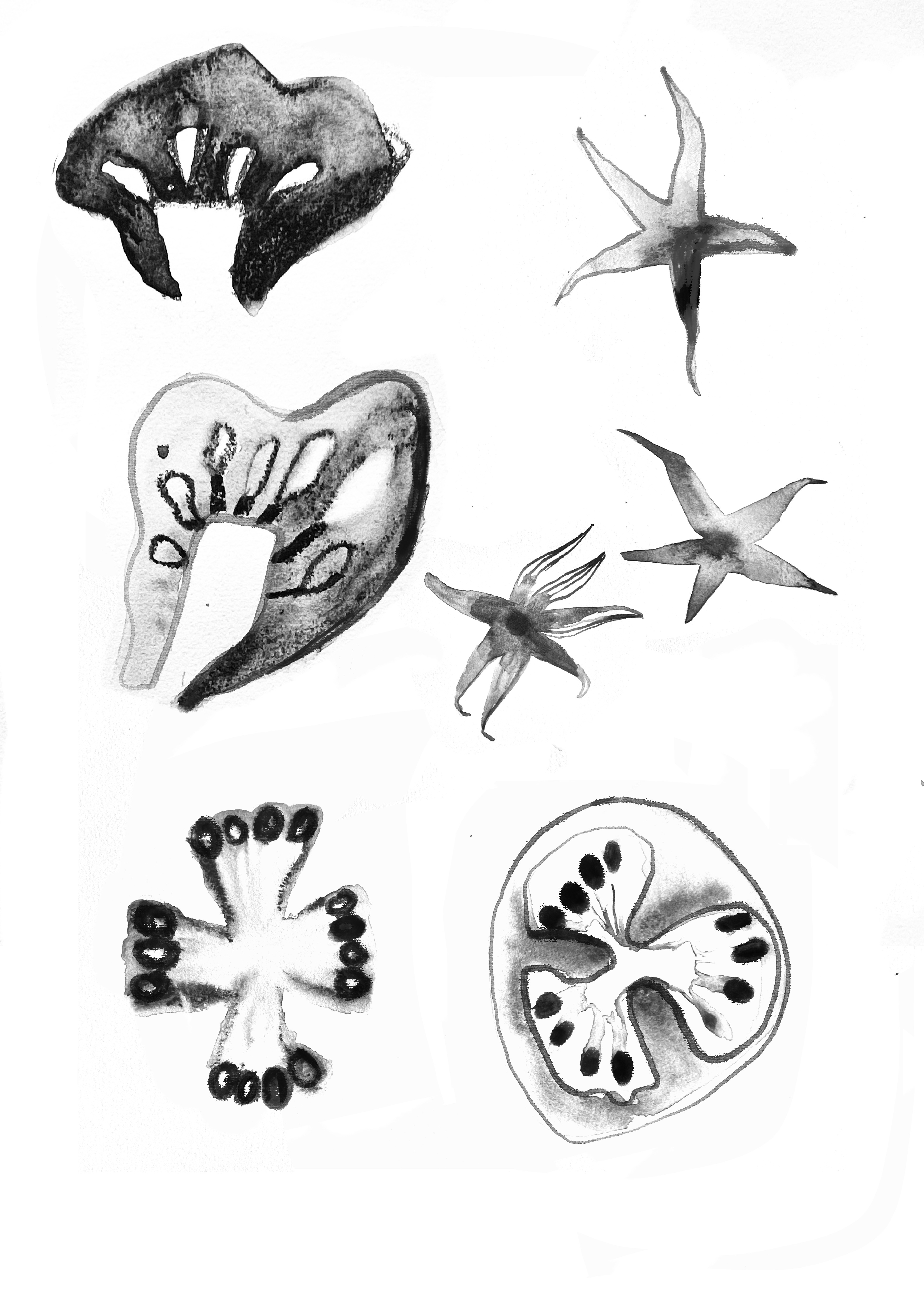
Shapes
Shapes found in tomatoes,these watercolour and Neocolor II studies of tomatoes were part of my lesson in Colori Flori 2025 titled Beyond Grey. These shapes are also elements used in the Pink Peonies artwork on this post.
For Contributing Subscribers
I’ve included the tomato shapes as they’re used as cutouts in the video lesson where we create the watercolour and mixed media floral below.