The artist who never ran out of bottles
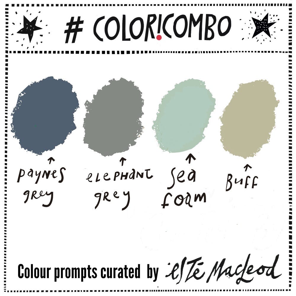
Week Twenty Nine is Paynes Grey, Elephant Grey, Sea Foam & Buff
A quick shoutout for the Summer Creative Retreat that runs from 1 to 6 August. I’m taking part and will be sharing my lesson, Small & Mighty on Monday 3 August. It’s built around colours and layering simple shapes. Grab your free spot here.

Today’s the birthday of an artist who found an entire universe in a handful of dusty bottles and jars without the need to look anywhere else for inspiration! Personally I’m in two minds about this: the dedication is admirable but I think the lack of variety in themes would become somewhat tiresome after a while. This week’s colours come from the Italian artist Giorgio Morandi.
Morandi (1890-1964) was born in Bologna and basically never left. He graduated in 1913 from the city’s Accademia di Belle Arti, later taught printmaking and etching there for over twenty years, and lived for most of his adult life in a modest apartment close by with his three sisters.
After Morandi’s studies, his first exhibition drew influence from Futurism and there was a short overlap with the Pittura Metafisica (the Metaphysical movement) of Giorgio de Chirico and Carlo Carrà which inspired him to create a small number of enigmatic, dreamlike still lifes. However he shrugged off both movements fairly quickly and spent the rest of his career doing something much quieter and probably much harder!
Morandi started painting the same objects, over and over, for the next four decades: bottles, jars, vases and boxes. He kept a collection of these in his studio - they filled the shelves and would be arranged and rearranged to create a composition on a table in his studio. Morandi often painted his props with varnish or matte paint, or even coated them with dust, so that they wouldn’t reflect the light. He was known as the Monk of Bologna for his quiet craft and meditative discipline.
When he was happy with the arrangement and the light was perfect, he would paint it, the last step in the process often the quickest. The colours he favoured and became known for were a family of ochres, dusty pinks, greys and soft blues with low saturation, low contrast and muted hues. Each composition was a tiny negotiation between shapes, relationships between negative and positive space and how close two forms can sit before the whole balance tips.
In spite of Morandi’s low profile (there are only two published interviews with him), his works were well recognised and in demand across Europe and the Americas. As early as 1934, he was being seen by some as the greatest living Italian painter and in 1948 he won first prize at the Venice Biennale. In 1949 he was featured in the exhibition 20th Century Italian Art at New York’s Museum of Modern Art and in 1957 he was awarded the Grand Prize for painting at the São Paulo Biennale in Brazil, ahead of works by Pollock and Chagall.
The Museo Morandi in Bologna holds a wonderful collection of his studio objects alongside the paintings and I’m sure that seeing the actual bottles next to the finished works is quite a thrill.
Read more about Morandi here and here and watch a video about his life here.
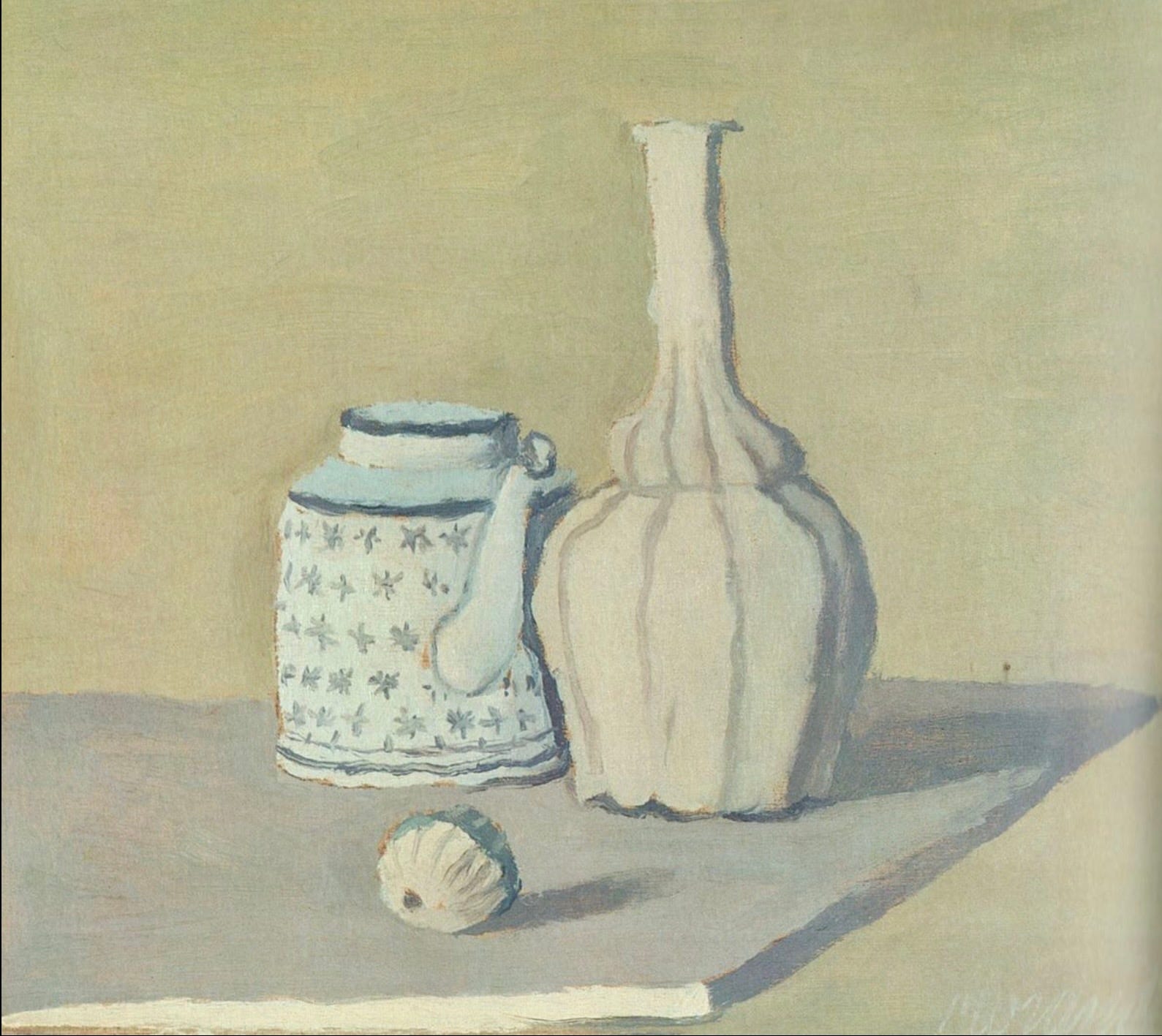
“Natura Morta (Still Life)”, oil on canvas, Giorgio Morandi, 1951
Colour Combination
The colours this week are Paynes Grey, Elephant Grey, Sea Foam & Buff. Use them along with a contrasting dark and neutral light colour to create an artwork in any medium or style. If you enjoy this weekly dollop of colour and creativity please share this post with someone else who might like them as well.
Shapes
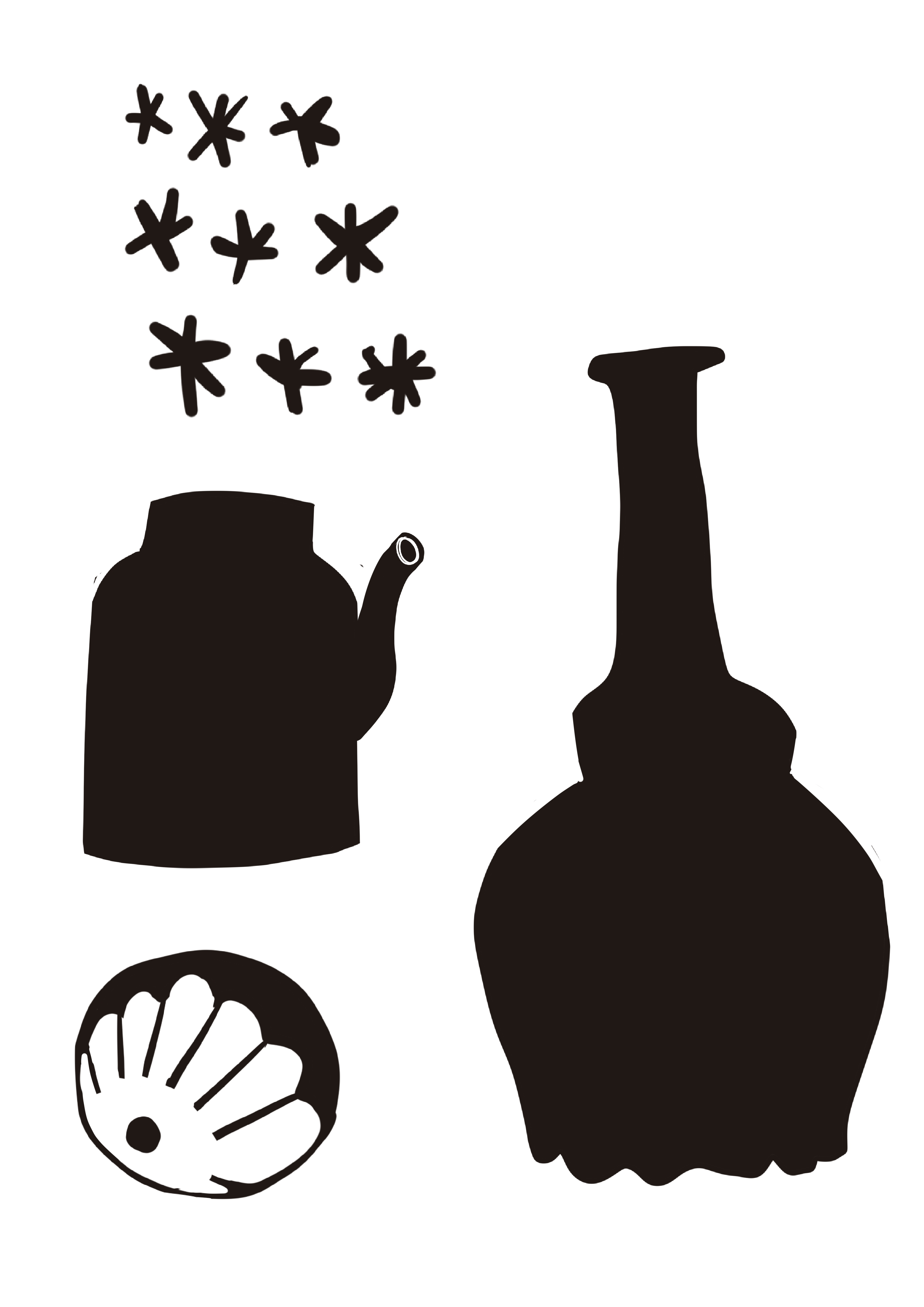
Along with the colour prompt I am including some shapes inspired by the artwork which you can download as a PDF and print out to use as you wish