The colour of life, growth and abundance
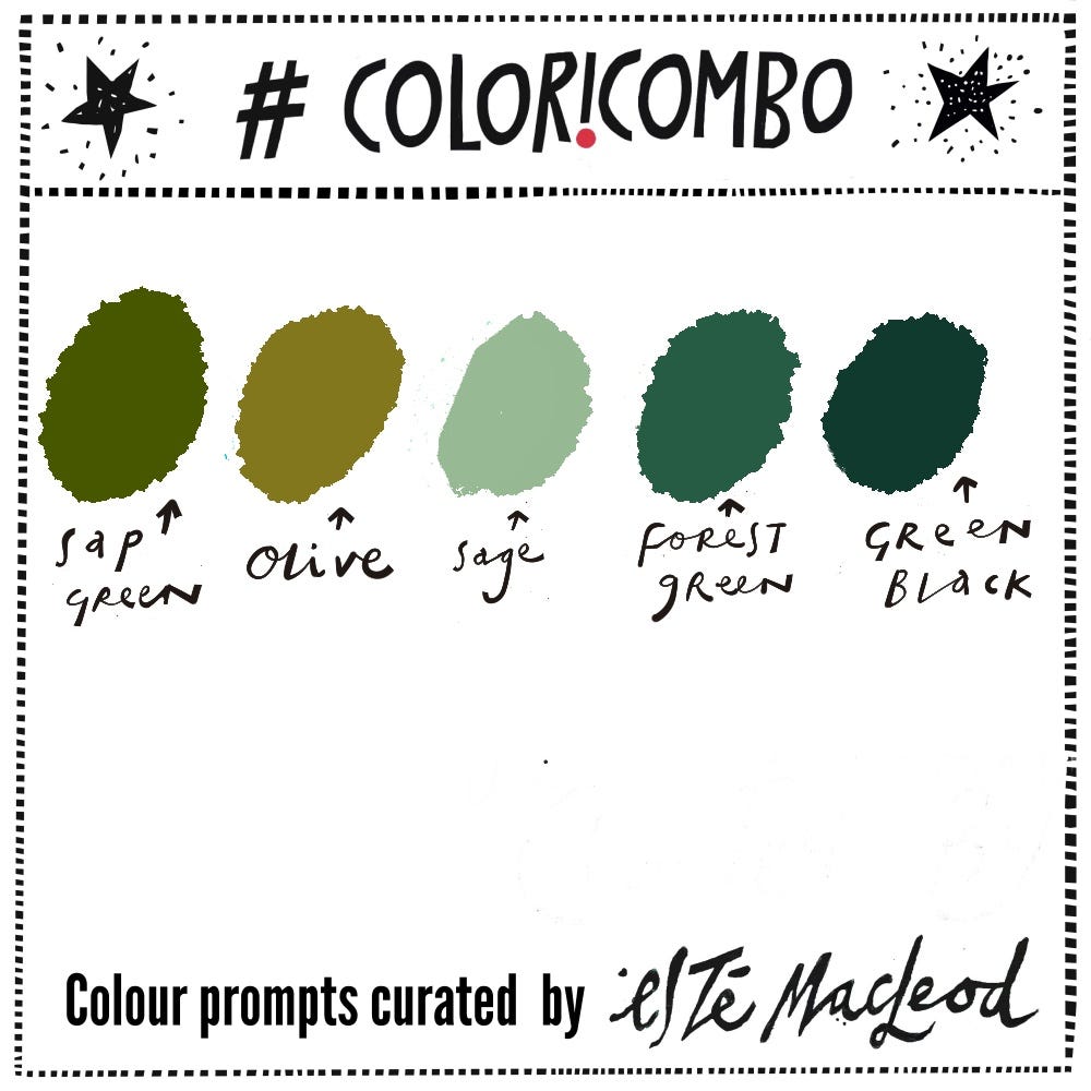
Week Twenty Four is Sap Green, Olive, Sage, Forest Green & Green Black
‘Nature in her green, tranquil woods heals and soothes all afflictions.’ - John Muir
For most of June we are in South West France, staying in the Vézère river valley close to the medieval town of Montignac, the Lascaux caves and other prehistoric sites. It’s a wonderful region to explore.
Whenever we are in this part of France, I’m struck by the expanse of green that surrounds us and the various shades of it. We’ve enjoyed long walks with our dogs in the countryside and next to the Vézère and Dordogne rivers every day - at this time of year it is rejuvenating to walk under the fresh green canopies of tall trees in ancient woodlands, but also amongst the farmlands, hedgerows and grass covered valleys. Together with virtually no light pollution and incredible views of the stars it’s a truly relaxing place to be.
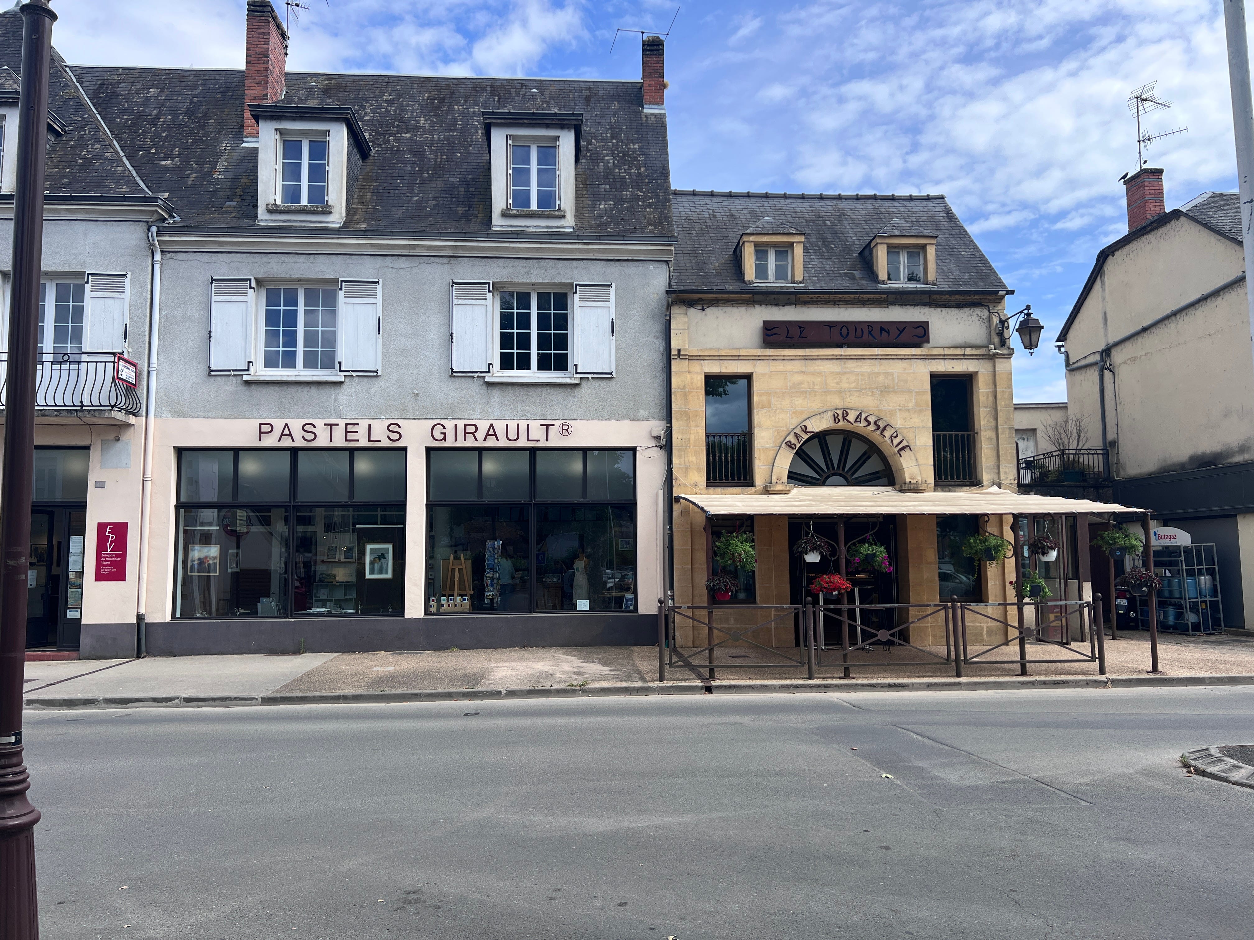
Like many creatives I’m a total sucker for art materials, and whilst in Montignac last week I obviously had to stop at the Pastels Girault gallery-shop. This company has been making pastels by hand since 1780 and, they come in a range of 400 beautiful colours. I have to confess, pastels aren’t amongst my favourite materials to work in, but I had buy a few sticks, and opted for some shades of green (photo after use!).


Green is the most abundant colour in nature and it sits in the middle of the colour spectrum, between yellow and blue. That makes it a natural mixing colour, one that artists have been creating deliberately for centuries. In the Renaissance, artists mixed blue and yellow to make green because pure green pigments were either expensive or unreliable. These days we’ve got the luxury of synthetic greens but these often feel flat compared to the luminous, complex colours we see in nature. Why’s that? It’s because natural greens are never pure: they’re always tinged with yellow, blue, grey or brown depending on light, shadow and season.
Historically, green held different meanings across cultures and time periods. In Medieval art it symbolised hope and renewal whilst in the Renaissance it represented life and fertility. The green pigments used then were natural but with issues - Verdigris was made from copper and was toxic and unstable whilst Malachite was precious and expensive. It wasn’t until synthetic pigments were developed that artists had reliable, accessible greens.
Viridian, created in 1838, revolutionised landscape painting because it was both permanent and brilliant, and could be mixed with other colours without losing integrity. This changed how artists approached depicting foliage and natural scenes.
What’s fascinating about green is its range and subtlety. A single tree in nature contains dozens of different greens like pale yellow-greens in new spring growth, deep blue-greens in shadow and warm olive-greens in fallen leaves. Our eyes are remarkably sensitive to these variations and we can distinguish more shades of green than almost any other colour.
In terms of colour theory, green is unique because it sits at the point where warm and cool meet. Yellow-greens vibrate with energy and warmth, suggesting growth and Spring. Blue-greens feel calm, cool, and contemplative, suggesting water and shadow. This means green can work with virtually any other colour on the palette - it bridges warm and cool.
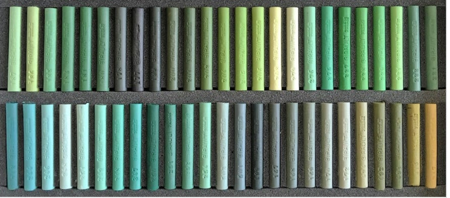
Look at this selection of colours from Girault, each a green with it’s own descriptive name and colour code that you can see here or take a look at the shades on Wikipedia here.
Below is a recording of a short video of me drawing in pastels some leaves in this week’s five colours. I also use a smudging tool and added detail afterwards with a dark green Luminance pencil (code 719) I use Degas Fixative to fix the colours, it is odour free and non toxic.
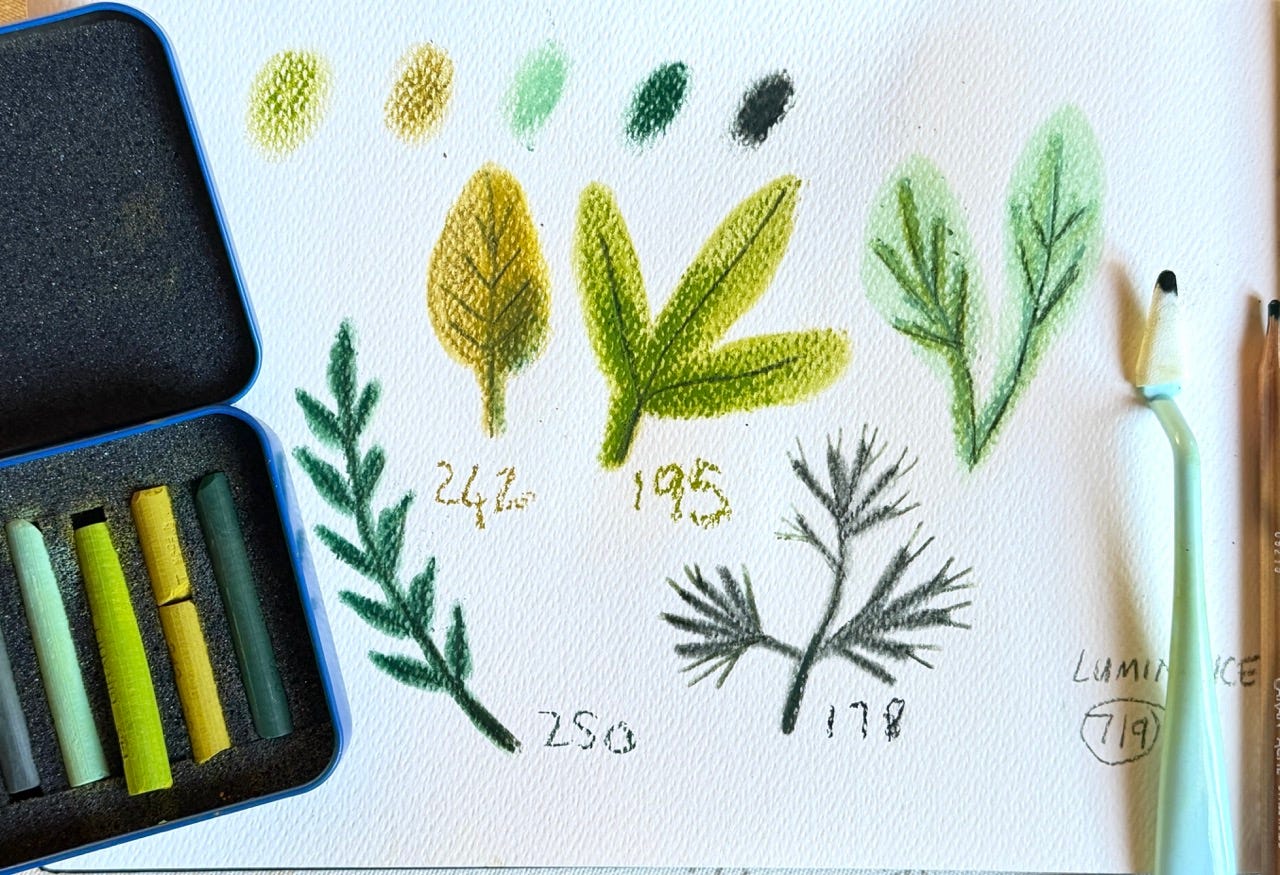
“Greens”, pastel on watercolour paper, Esté MacLeod 2026
Colour Combination
The colours this week are Sap Green, Olive, Sage, Forest Green & Green Black. Use them along with a contrasting dark and neutral light colour to create an artwork in any medium or style. If you know of someone who might enjoy a weekly dollop of colour and creativity please share this post with them.
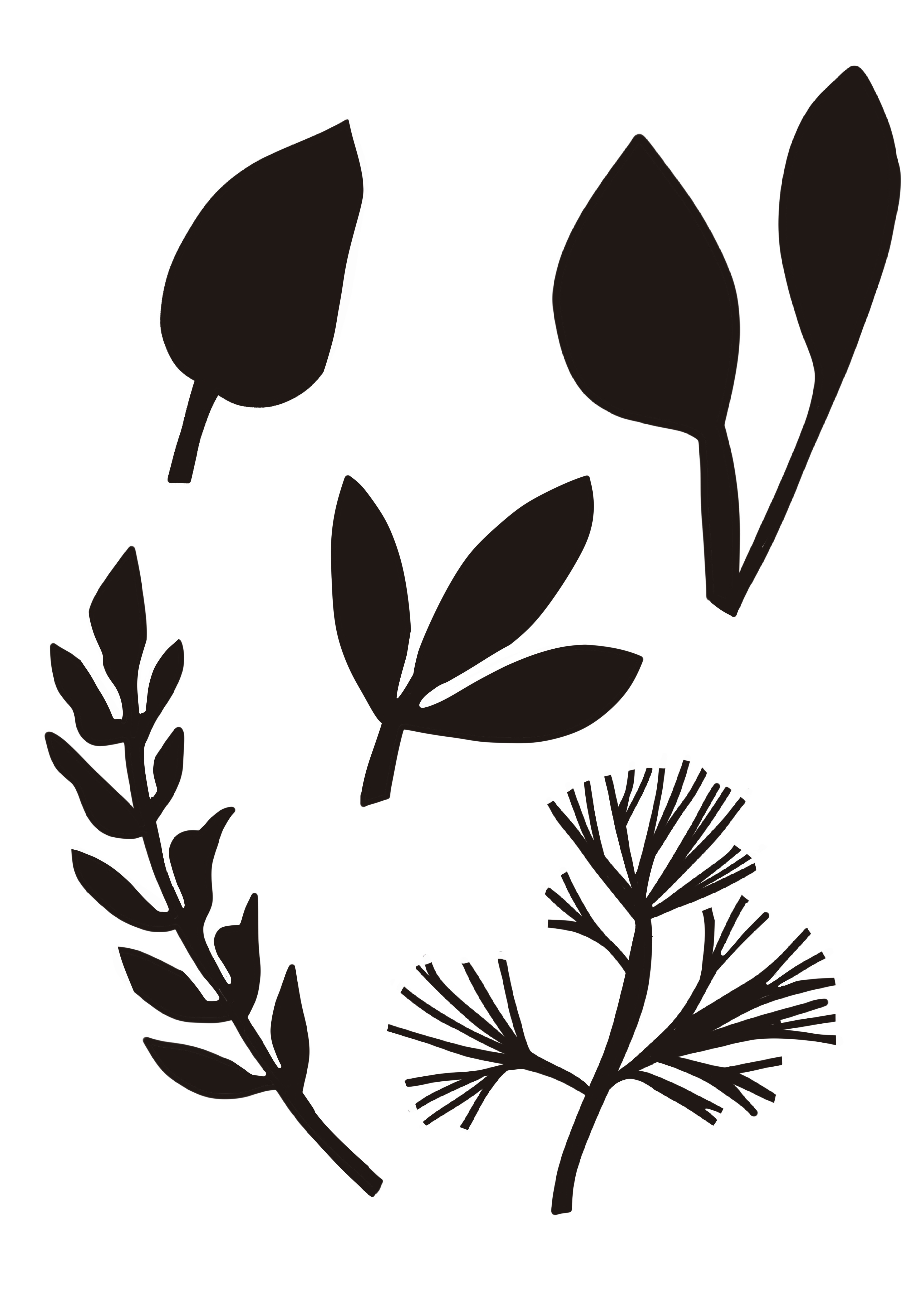
Shapes
Along with the colour prompt I am including some shapes inspired by the artwork which you can download as a PDF and print out to use as you wish.