The possibilities of colour
Week Thirty One is Cyan Blue, Lemon Yellow, Magenta & Key Black
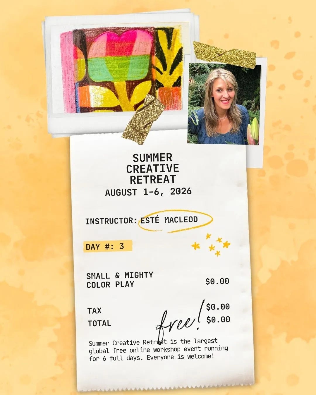
Firstly, you are invited to join us later today for my live workshop! I’m taking part in this year’s Summer Creative Retreat my lesson, Small & Mighty, will be about using this week’s Coloricombo palette to create miniature artworks in sketchbooks, Tiny ink pads, pencils and markers will be incorporated. The 45 minute lesson will be streamed live today, Monday 3 August, at 11h00 PDT.

Signup below and you’ll be able to see everything from over 50 instructors free for a limited time. I’ve also recorded a special mini-lesson titled Inside the Box for the goody bag available to everyone who joins the paid-for option.
The complexities of colour
Red, yellow and blue are known as the primary colours so why does every printer use cyan, magenta, yellow and key black?
Simple answer is that the primaries were never quite right to begin with! They’re a decent approximation for mixing paint (albeit it limited for most brighter colours), but they’re not the true primaries when it comes to subtracting colour from white light, which is exactly what ink on paper is doing. For that you need CMYK, the abbreviation for the four colour components used in printing.
Light and pigment work in opposite directions: a computer screen builds colour by adding red, green and blue light together. That’s ‘additive colour’ and it’s why mixing all three at full strength gives you white.
Ink does exactly the reverse. Ink sits on paper and subtracts wavelengths from the light bouncing off it, absorbing everything except what’s meant to be seen. Cyan, magenta and yellow are the purest possible absorbers for that job, each one blocking roughly a third of the visible spectrum while reflecting the rest.
Red, yellow and blue simply can’t subtract as cleanly. Mix them up, take a look at the muddy brown result on paper and you get the idea.
Back in 1906, Thomas A. Lenci took the existing CMY model, added black (represented by a K, read on to find out why) and invented CMYK. His Eagle Printing Ink Company of New York was the first printers to prove that these colors could be layered over a white substrate to produce a previously unseen range of colors.
So where does the K come in and why is it so important? It stands for key because in four colour printing the cyan, magenta and yellow printing plates are carefully keyed (or aligned) with the black key plate, the plate that prints the detail of an image. The letter B couldn’t be used, because it was already widely used to refer to blue and anyway it would have been really confusing given the C for cyan!
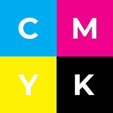
Yes, combining CMY should produce black, but in reality it’s a bit of a murky greenish brown. Using a pure black solves this problem, plus it saves ink and drying time on anything that needs printed with large dark areas or black text.
Read more about CMYK here (excellent graphic showing subtractive vs additive colours) and here.
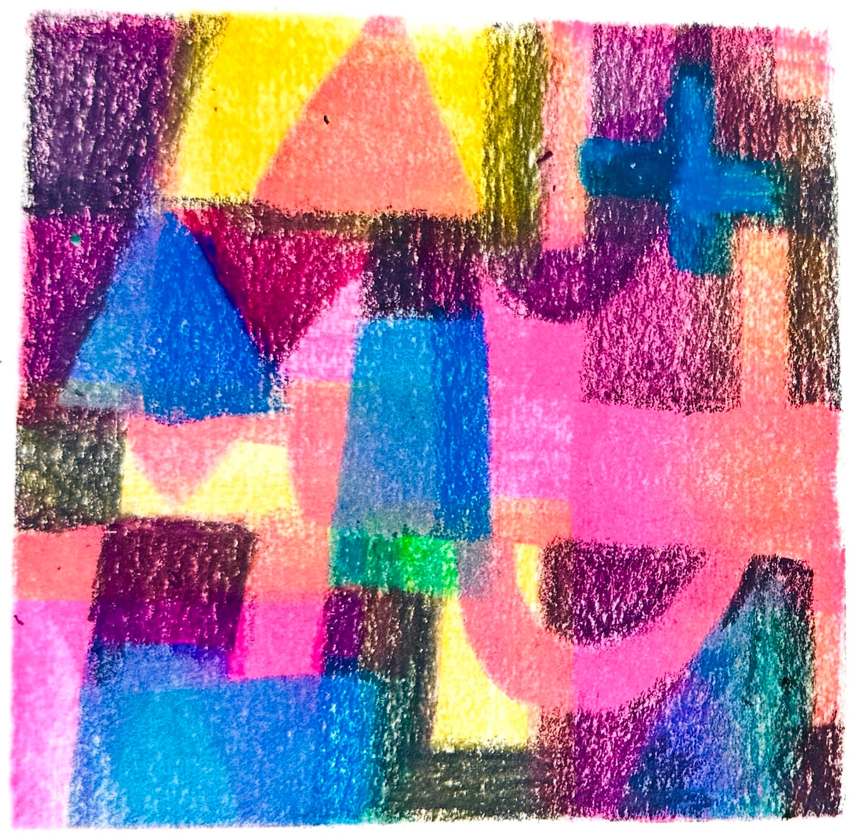
‘Small sketchbook artwork created for the Inside the Box mini course. Esté MacLeod, 2026
Colour Combination
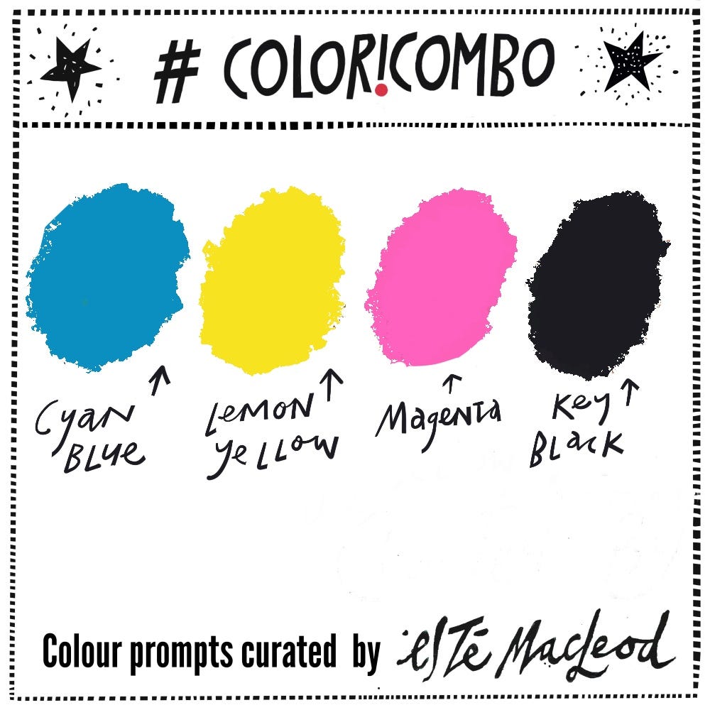
The colours this week are Cyan, Lemon Yellow, Magenta & Key Black. Use them along with a contrasting dark and neutral light colour to create an artwork in any medium or style. If you are enjoying these weekly colour and creativity prompts and know others who would too please share this post with them.
Shapes
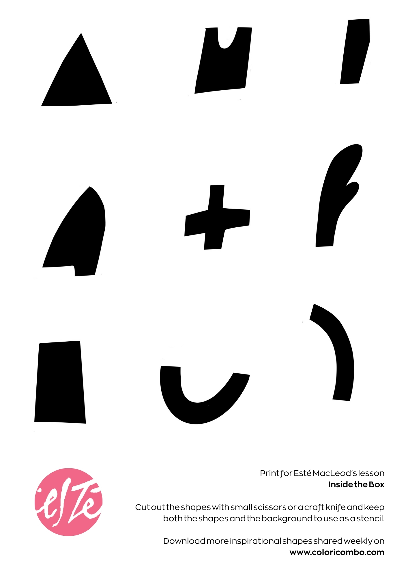
Along with the colour prompt I am including some shapes that are used in the live session and mini course. You can download them as a PDF and print out to use as you wish.