

Who coined the term 'graphic designer'?
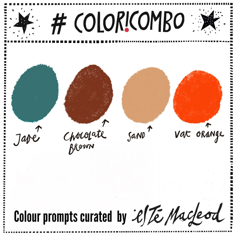
Week One's colours are Jade, Chocolate Brown, Sand & Vat Orange
Please read to the end to download this week’s shapes, new for 2026.
Graphic Designer… Did anyone answer W.A. Dwiggins? It was William Addison Dwiggins (1880-1956) who came up with the title graphic designer in 1922. Prior to that, artists in the discipline worked under a multitude of mostly generic titles so Dwiggins described himself as a graphic designer to try and explain his skillset and the many genres he worked in - a pioneer of advertising, magazine and book design.
Aside from his memorable name, I was struck by photographs of Dwiggins I found whilst putting together this week’s profile - he had a good sense of humour and just looks like such a fun, mischievous character.
“It is not overly legible. It has no grace. Gothic capitals are indispensable, but there are no good Gothic capitals.”
- W.A. Dwiggins
Born in Ohio USA, Dwiggins studied with the legendary printer, artist and type designer Frederic Goudy (most remembered for the font Copperplate Gothic!). He started out doing advertising and lettering work but a diabetes diagnosis in 1922 changed everything. Back then diabetes was often fatal and Dwiggins decided to give up “the more banal kind of advertising”, instead focussing on books and type design.
What set Dwiggins apart was his incredible range. He was once described as a calligrapher, type designer, typographer, a technician in many untrodden ways of illustration and decoration, notable book designer, puppeteer and an authority on puppeteer joints”. He designed 329 books for Alfred A. Knopf, seventeen of which were chosen as AIGA selections, and he brought a boldness and an ornamental feel to book design that brought in Art Deco and Oriental styles.
“Ornament is a music of space”
- W.A. Dwiggins
You’ve probably read something set in one of his many typefaces recently - he designed the popular fonts Caledonia, Electra, Eldorado and Metro.
Read more about Dwiggins from AIGA here. There’s an article about his recently published biography here and you can see all of his AIGA nominations here. There’s also a very interesting article about his lost typefaces here.
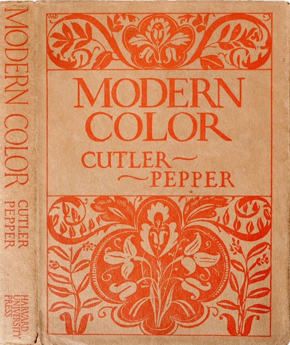
“Modern Color”, book cover designed by W.A. Dwiggins, 1923
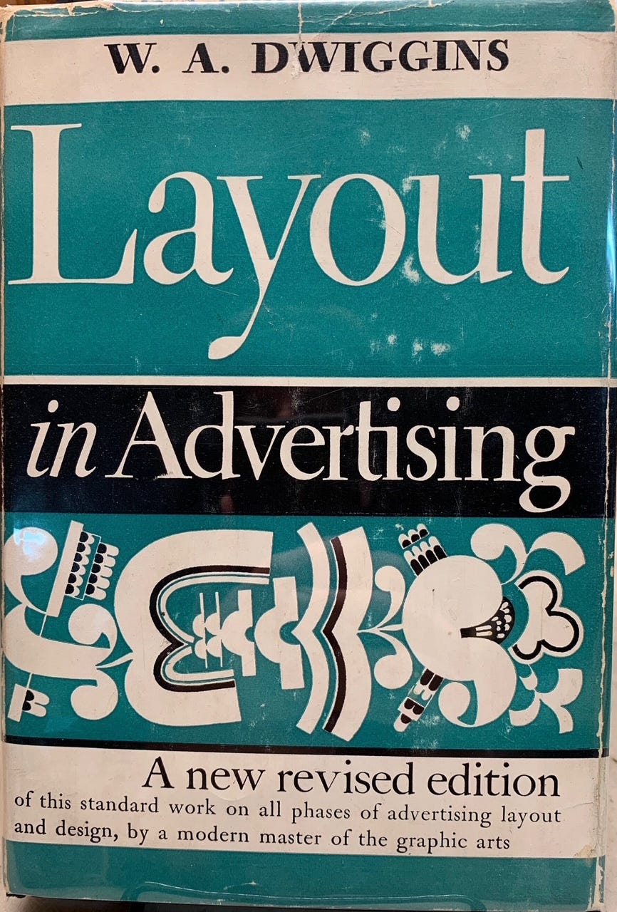
“Layout in AdvertisingM”, book cover designed by W.A. Dwiggins, 1928
Colour Combination
The colours this week are taken from two books covers as they’re both monochromatic. They are Jade, Chocolate Brown, Sand & Vat Orange. Use the colours along with a contrasting dark and neutral light colour to create an artwork in any medium or style. Share this post with someone who likes colour and might enjoy a weekly dollop of colour and creativity.
It is fun to see what you create with the prompts, thank you for sharing your creations. If you’re posting on Instagram, please tag #coloricombo and #estemacleod and join us in the private Facebook group Creative Prompts.
New for 2026… Shapes
2026 has started and this is also the beginning of the fifth year of the Coloricombo creative prompts program. On 1 January I shared a post about how Coloricombo came about along with future plans.

A fresh colour palette will be shared every Monday, and to add some extra inspiration some shapes are thrown in as well to compliment a little story about a past artist, designer or inspiring event.
Using letters to start drawings is something I’ve been teaching in my online courses over the last decade, and three of them have been added in this prompt, the letters J O Y.
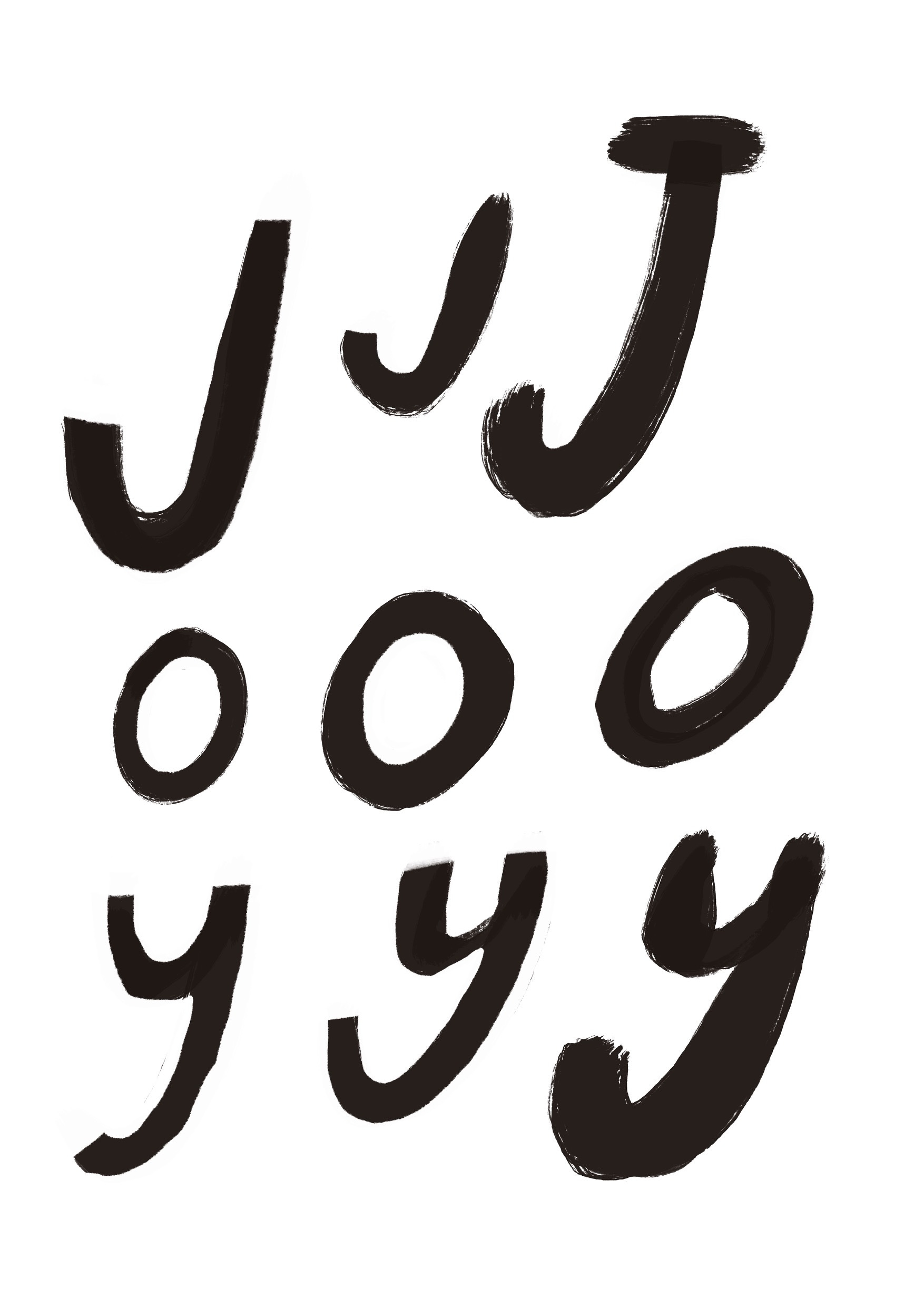
Print out the sheet or use your own letters, use these shapes as you like. Have a look at the live demo I did on 3 January where the letters are handy anchor points for sketchbook doodling.

Welcome!
A very special welcome to all of my new subscribers and a big thank you to everyone who’s a contributing subscriber, old or new. I’ve said it before, but you help to make this happen: Coloricombo wouldn’t work without your support.