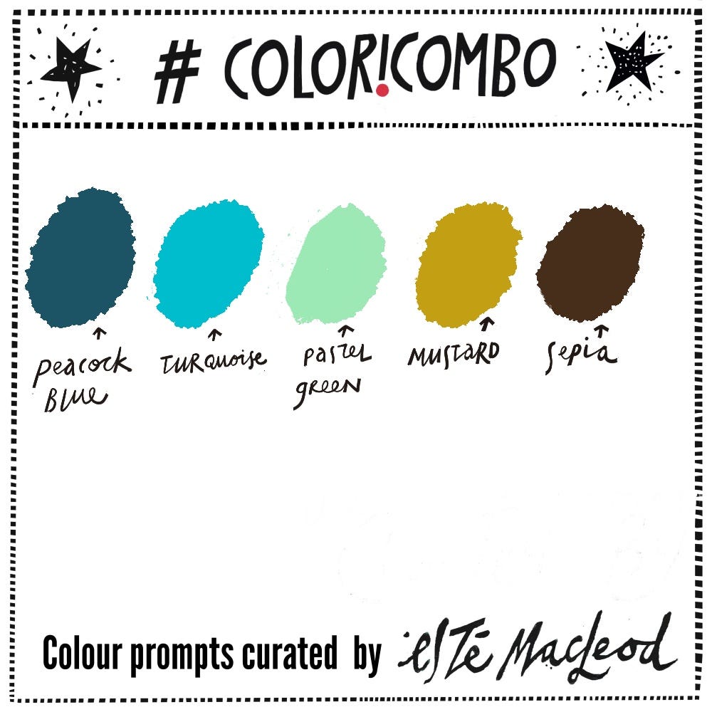
This week’s colours come from a layered watercolour artwork I’ve created for this years Colori Flori Summit. I love painting in aquatic colours with a warm yellow and brown for contrast. You can get a glimpse of the artwork in progress below.
Week Two of the summit has started after the first seven lessons were shared last week together with two bonus projects that have been added right here on Substack.


You can still join Colori Flori which includes lifetime access, registration closes this weekend (midnight PST on 31 May).
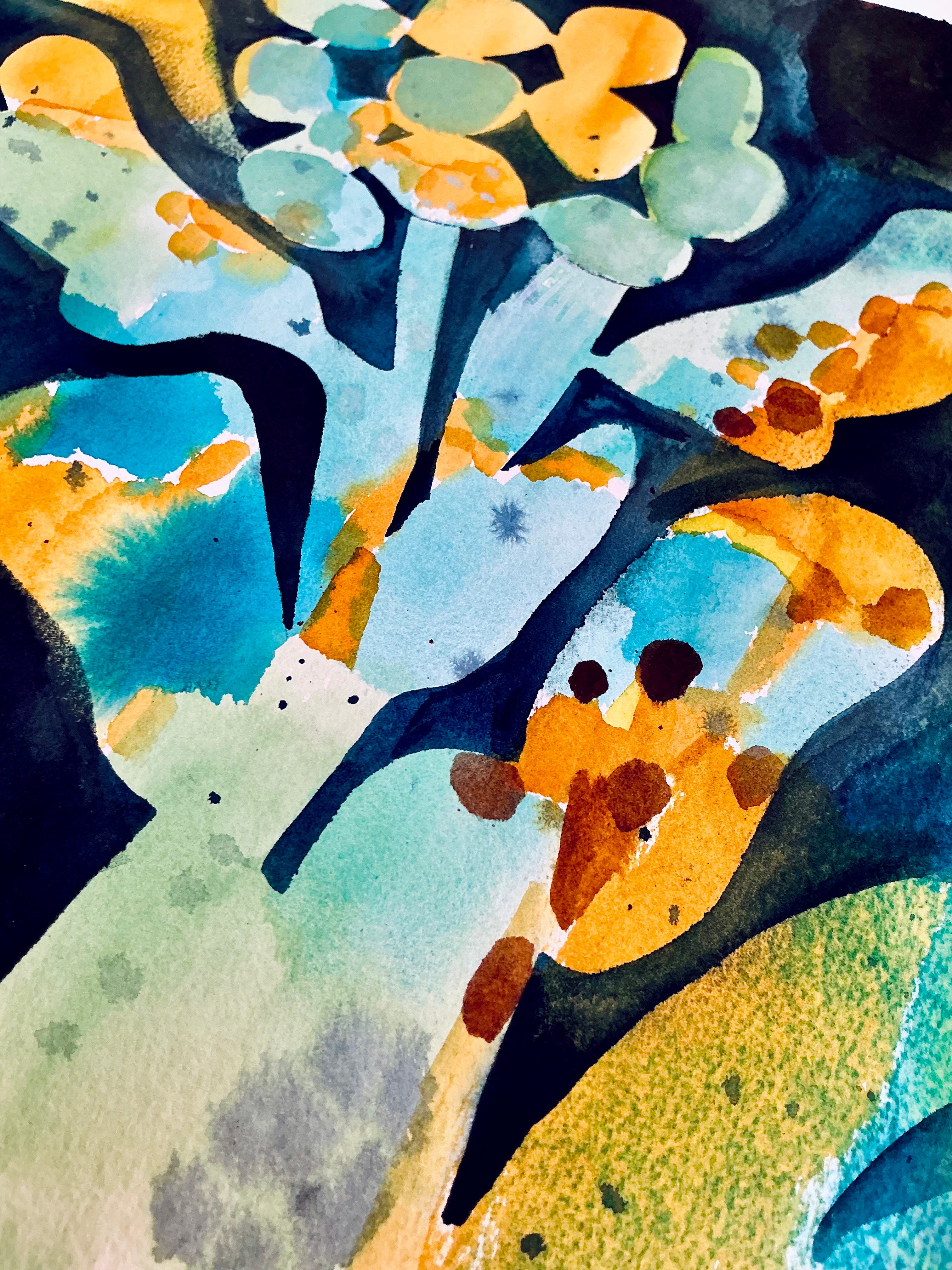
“Doodle Bloom” watercolour and gouache on paper, Esté MacLeod, 2026
Colour Combination
The colours this week are Peacock Blue, Turquoise, Pastel Green, Mustard & Sepia. Use them along with a contrasting dark and neutral light colour to create an artwork in any medium or style. Know someone who might enjoy a weekly dollop of colour and creativity? Why not share this post with them?
Shapes
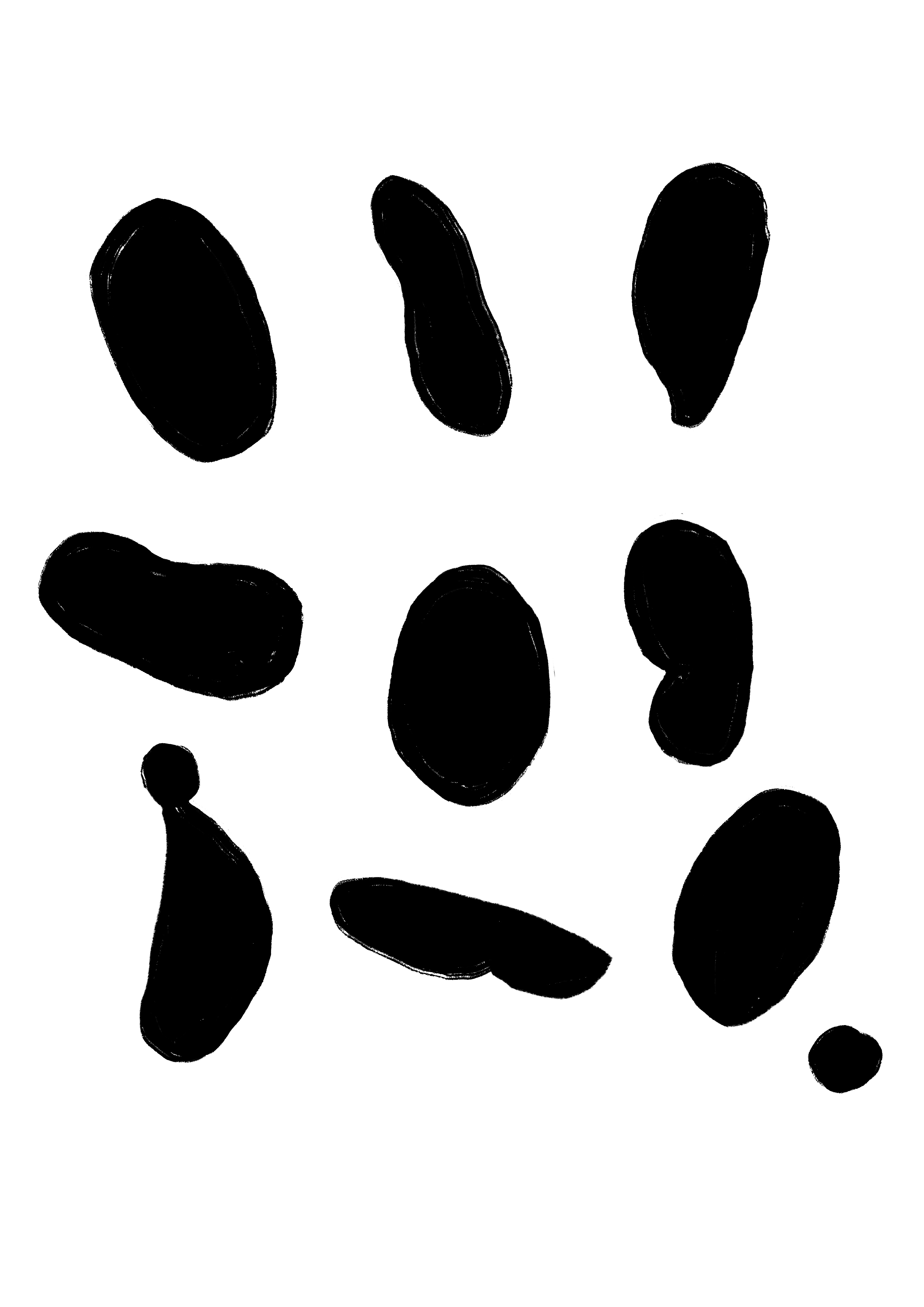
Along with the colour prompt I am including some shapes inspired by the artwork which you can download as a PDF and print out to use as you wish.